Since the invention of URLs in 1992, they have acted as the quiet but ubiquitous backbone of the internet. As applications were lifted from the desktop to the browser, the URL has become a core component of nearly every piece of business software. But for most apps, the URL structure is an after-thought to the core experience, a necessary routing engine or utility to be ignored by the user (a few lovely URL examples from Salesforce, Gmail, and the first ad I could find on Google Search):


Rather than treat our URL as an after-thought, we crafted our user experience around the URL – a user experience that creates greater depth of understanding for the user, and one that opens up both better, faster analysis and simple, logical sharing.
There’s nothing more frustrating than building an analysis or report in one context, and losing your work. For that reason we encode each portion of the query construction into the URL - fields, filters, and visualizations. Furthermore, workbooks can consist of not just one query, but many analyses in a single canvas, and we want to make sure it’s all instantly shareable and versioned for analysis.
There are many solutions we rejected:
Ignore the URL and offer an explicit workflow to share – you lose the back button and sacrifice the simplicity of web normalcy, ultimately this was a non-starter for us.
Hash the entire workbook into a single query slug – users would lose understanding for the user, or any interesting composition. This would have been the easiest, but just didn’t seem elegant enough.
Keep appending arguments until you have a 40 line URL - we did that at Looker to start and it worked great for a little bit – fun fact there are URL length limits. At the same time we need to balance the annoyance of constantly refreshing the URL (imagine if every edit in a Google doc updated the URL – cute but annoying).
We focused on striking a balance: #

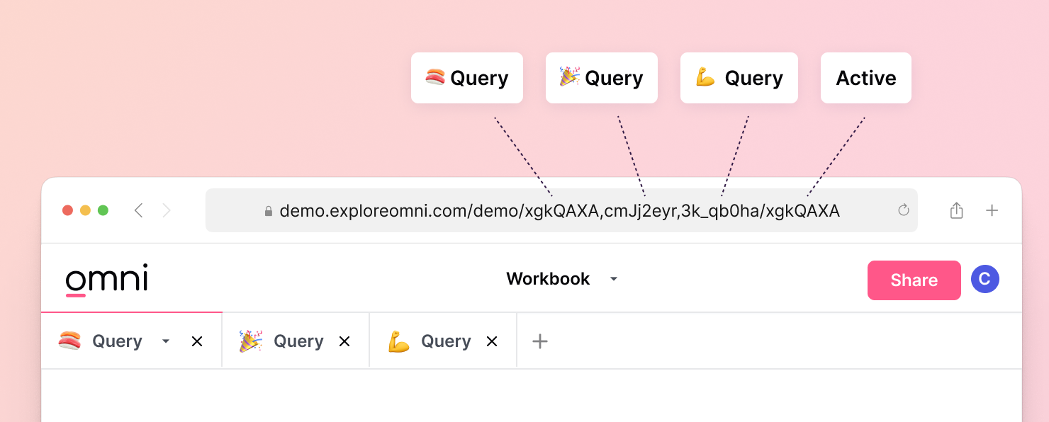
Explainable structure: Each tab (name, query, and visualization) is encoded separately, and the active tab is also encoded in the URL (note the four tabs above and four comma-delimited URL hashes). >> This means we get super powers like bringing a query from one workbook to another, with its visualization, or re-arranging the tabs via URL, or even saving or sharing only a single tab from the workbook – all for free!
Logical simplicity: Minimizing length and cruft in the URL, and encoding the broad pieces in logical order (the user’s organization, their data model, and then queries and the active tab)
Freedom to experiment: The back button works seamlessly, encoding each query or edits to visualization structure. >> This means reverting changes is as simple as clicking back, and old, unsaved work is always in your history.
Showing restraint: Field pickers actions, SQL composition, and menus states are excluded from the URL but stored in the browsers’ session state. >> So you never lose draft SQL in an inactive workbook tab, but get instant shareability as soon as it’s run.
Stored forever: Query slugs are persisted indefinitely, meaning work is never lost, even when you aren’t thinking about it. >> We’ll also have a follow-up from our engineering team on all the technical enablers for how we do this (and some math on hash collisions).
The result is an experience where the URL enhances the experience rather than float into the background for the user.
Portability, editing, and sharing are all embedded in the URL itself, and they’re short and readable so the user can follow along. Below we grab a couple analyses from other tabs, consolidate into a single workbook, and share our entire analysis, all entirely via the URL!
Take a look:

We’re going to continue this focus as we build out content and discovery in the system. Let us know if you’d like to give it a try!.
