Democratizing data remains one of the holy grails in the data world.
The hope is that by empowering stakeholders across the company to access data more directly in a self-service manner, they’ll be able to get insights faster and move more quickly.
At the same time, the data team frees up capacity to focus on more strategic projects instead of mostly fielding ad-hoc requests.

But while this sounds great in theory, most data leaders have yet to see it done successfully in practice.
Biz users either get stuck, unable to get the answer they need (and then still need to escalate to the data team for help), or they make mistakes and draw the wrong conclusions from the data. In the end, instead of making things more efficient, it can often feel like you just traded one set of problems for another.
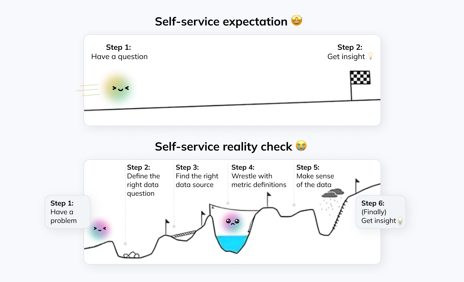
But that doesn’t mean you should give up on self-service analytics altogether. As always, reality is nuanced; self-service is neither the solution to all of your problems, nor an empty hype you should ignore.
Over the years, I’ve seen data democratization efforts at companies of all sizes, from early-stage startups to big tech companies. And I’ve come to the realization that there are concrete reasons why most companies’ attempts fail. The good news: Most of them can be addressed with a thoughtful approach.
This article will walk through how; specifically, we will cover:
Why most data democratization efforts fail — and how to avoid these mistakes
How to define an approach that works for your organization
The concrete steps you can take to successfully roll out a self-service effort in your company
Why most data democratization efforts fail #
While every company is unique, many attempts at data democratization get hamstrung by similar problems.
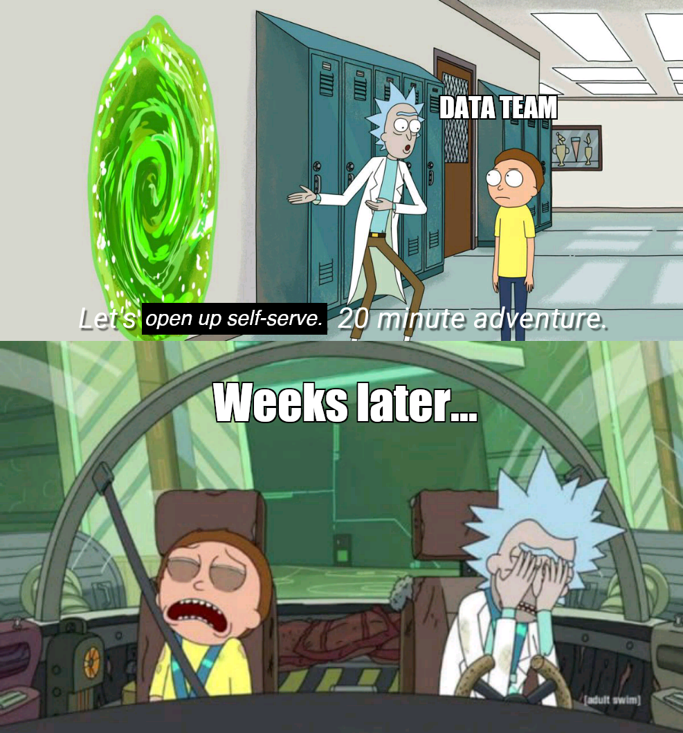
Let’s look at an example of how this often plays out in practice:
Step 1: Leadership decides to move to a self-service model
Step 2: The data team creates dashboards for common use cases and provides a few sample queries for additional deep dives
Step 3: An announcement is made that business stakeholders are now expected to handle their own ad-hoc data needs, and requests to the data team will be declined. Expecting their bandwidth to be freed up by this change, the data team reallocates its resources

Step 4: Business stakeholders are still submitting questions and requests. Instead of asking for data pulls, they’re now asking for support with queries and help with metrics discrepancies
End result: The data team is spending as much time supporting business stakeholders as before and strategic projects are pushed to “later”. The data democratization effort is seen as unsuccessful and teams move on to other priorities
The issues described here can be traced back to two common themes:
Ill-defined or unrealistic expectations
Insufficient investment into the ongoing data democratization effort
Let’s look at these in more detail so you can avoid falling into the same traps.
1. Ill-defined or unrealistic expectations #
Many companies don’t clearly define what they actually mean by “enabling self-service” or “democratizing data” at the beginning of the work stream.
As a result, different stakeholders develop their own interpretation of these vague terms; and when that happens, the effort is doomed from the start. Regardless of what actually gets implemented: Since everyone has different expectations, someone will be dissatisfied with the outcome.
And even when there are explicit expectations and goals, they’re often overly optimistic. As a result, disappointment is guaranteed even if you’re making meaningful progress towards self-service.
First of all, data democratization is a spectrum rather than a binary choice. This means it’s unrealistic to expect all analytics tasks to be handled by stakeholders completely autonomously without any data team involvement.
Similar to how AI coding tools don’t remove the need for oversight from engineers, a push towards self-service analytics doesn’t completely remove the data team from the equation. Instead, the role evolves from executing every single analytics task end-to-end to enabling business stakeholders to get the insights they need and handling follow-up questions.
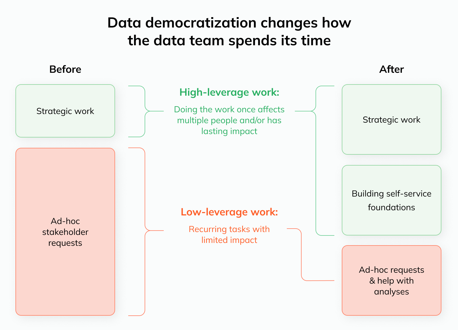
The benefit of this transition is that the focus shifts towards high-leverage instead of low-leverage tasks:
Doing data pulls and creating ad-hoc visualizations for stakeholders is low-leverage: Each request typically only benefits one stakeholder, and there are few long-term benefits (solving one doesn’t make the next one more efficient)
Building self-service foundations is high-leverage: You do the work once, and 1) it affects many stakeholders 2) over an extended period of time. This amplified impact means that some bandwidth will be freed up to work on other projects
Secondly, it’s equally unlikely that this transition will happen overnight. I often see hard “cutover dates” for these types of efforts; i.e. after a certain date, teams are expected to adjust to the new state of the world and any requests to the data team will be rejected.
However, that’s not how things work in practice. Stakeholders need time to build their analytics muscles (and confidence), and they’ll inevitably run into many challenges as they handle these new tasks for the first time.
As data experts, it’s our job to guide them on this journey — not leave them to fend for themselves.
2. Insufficient investment into the ongoing data democratization effort #
As a direct result of these unrealistic expectations, there is often an insufficient investment into the necessary education, tooling, and processes to enable successful data democratization.
First, the initial resource investment that’s required is often underestimated. Business users won’t be able to self-serve using the same processes and tools that the data team uses, so this means data workflows have to be reimagined based on the capabilities of the new user base.
That’s why there’s so much excitement around AI right now; in theory, it has the potential to remove a lot of the friction around data access and insights generation for business users. We’ll get more into this potential (and caveats) below.
In addition, the resource investment shouldn’t be viewed as one-off. As mentioned above, data teams should expect to remain involved by creating self-serve resources, fielding follow-up questions, and putting guardrails in place, so you need to budget bandwidth for that.
So, what can you do to avoid the failure modes discussed here? In the next section, we’ll get into how you can define a more realistic self-service strategy and the concrete steps you can take to successfully implement it.
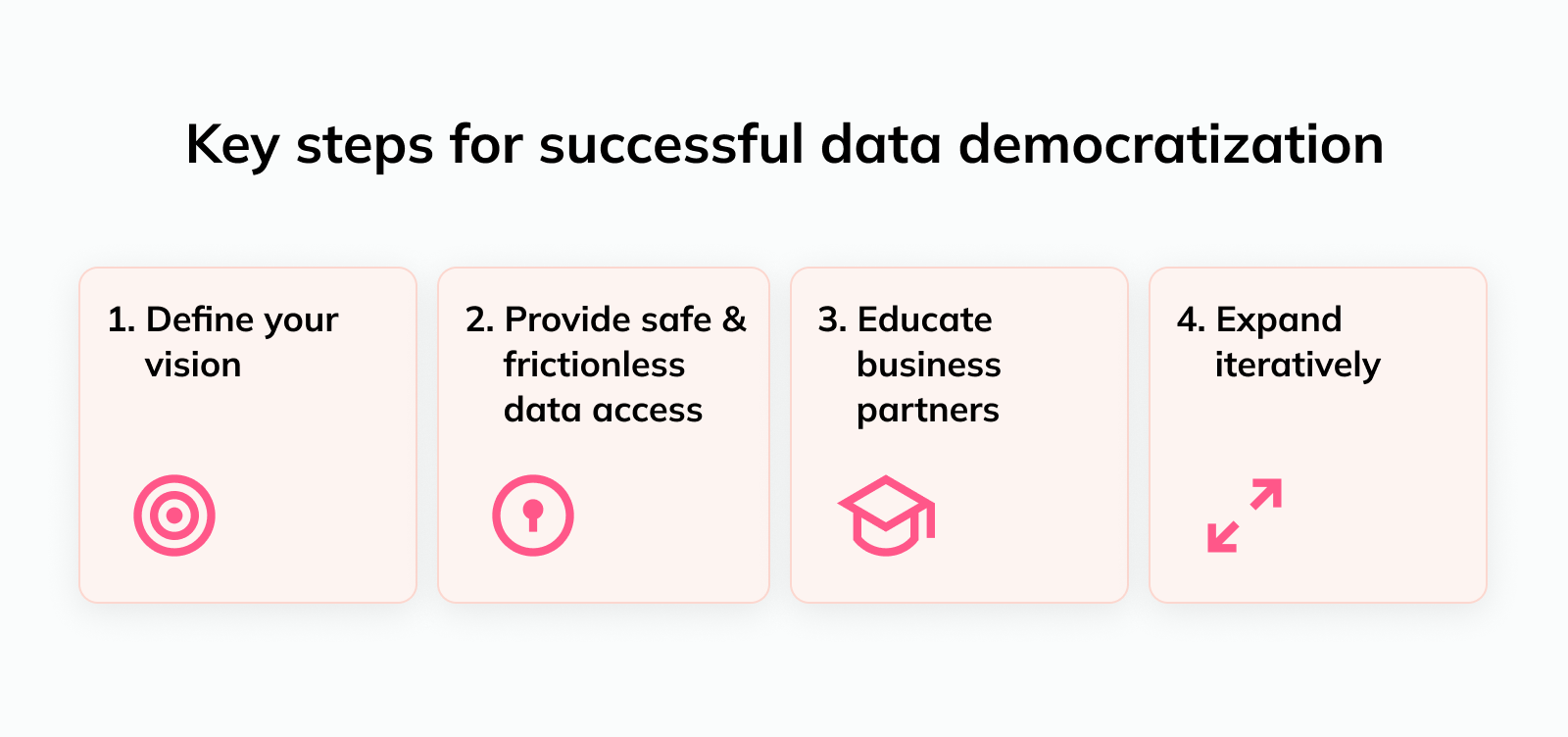
4 steps for successful data democratization #
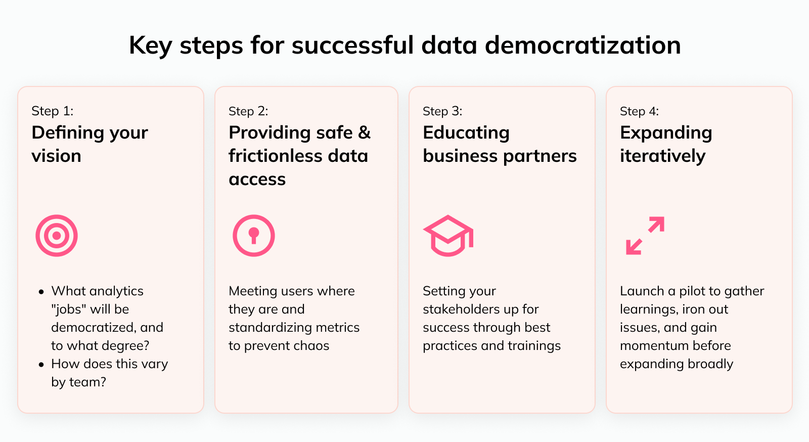
A successful data democratization effort has several key requirements. The most important steps are:
Below, we’ll double-click on each step and talk about how you can customize this for your particular company.
1️⃣ Defining your vision for data democratization #
Without a clear vision, you 1) can’t get stakeholders bought into what you’re trying to do, and 2) won’t know what you need to put in place for a successful transition.
At a minimum, you need to define:
Why you’re implementing self-service and what impact you hope to achieve
What analytics tasks should move towards a self-service model, and
How the degree of self-service varies by business area or team
Defining the motivation for and desired impact of self-service
The clearer you are about why you’re pursuing self-service, the easier it will be to know if you’ve been successful. For example:
Do you hope to free up bandwidth to tackle specific projects from your backlog?
Is the team burnt out from ad-hoc requests and you want to minimize the number of tickets they handle?
Do business teams see the data team as a bottleneck, and you want to accelerate time to insight?
Are you trying to reduce “key person risk” or data bottlenecks where only a single analyst or small group knows how to pull certain data?
Depending on what the driving factors are in your case, you can define clear success criteria and then track against those. And you’ll avoid scenarios like we discussed above where you’ll end up with disappointed stakeholders due to misaligned expectations.
Deciding what tasks should be self-service
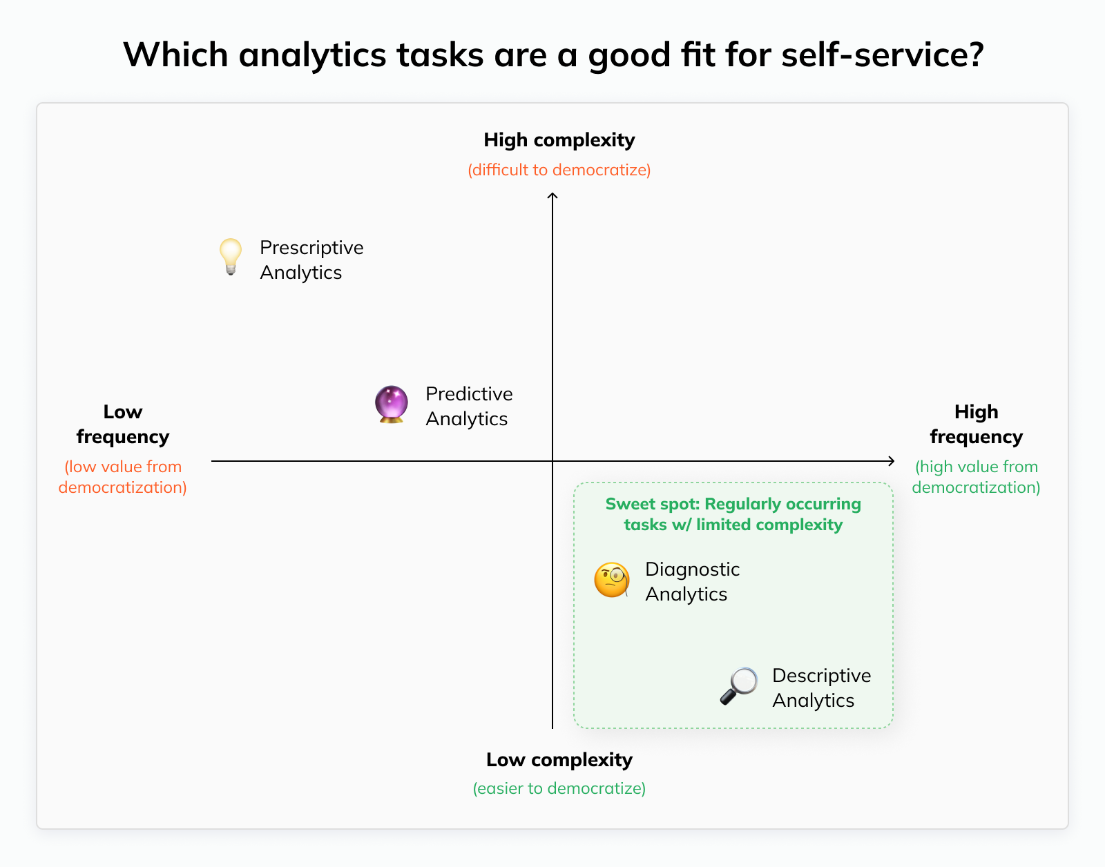
Business stakeholders have a few core “Jobs To Be Done” that they traditionally need the data team’s help with; these map to the four types of analytics that people commonly distinguish:
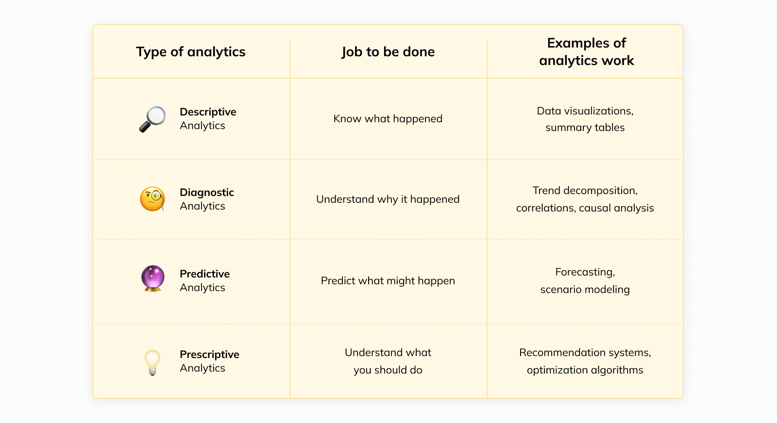
Some of these “jobs” are easier for stakeholders to handle fully autonomously than others.
For example, with the right resources in place, doing a simple investigation to understand the root cause of a metric movement is realistic. Expecting business stakeholders to create their own sophisticated forecasts or design experiments — not so much.
At the same time, the benefits you can expect differ by analytics “job”. The more frequent an analytics task is, the larger the benefit from opening up self-service: You resolve more bottlenecks, and the data team wins back more time.
Combining these two dimensions, we get the sweet spot for self-service analytics: Tasks that need to be handled frequently but have limited complexity.
Deciding the degree of self-service appropriate for each business area or team
Not all teams benefit from data democratization equally. Ultimately, it comes down to a trade-off between the expected benefits on one hand and risks on the other hand.
Whether the benefits outweigh the potential adverse consequences depends on a few factors:
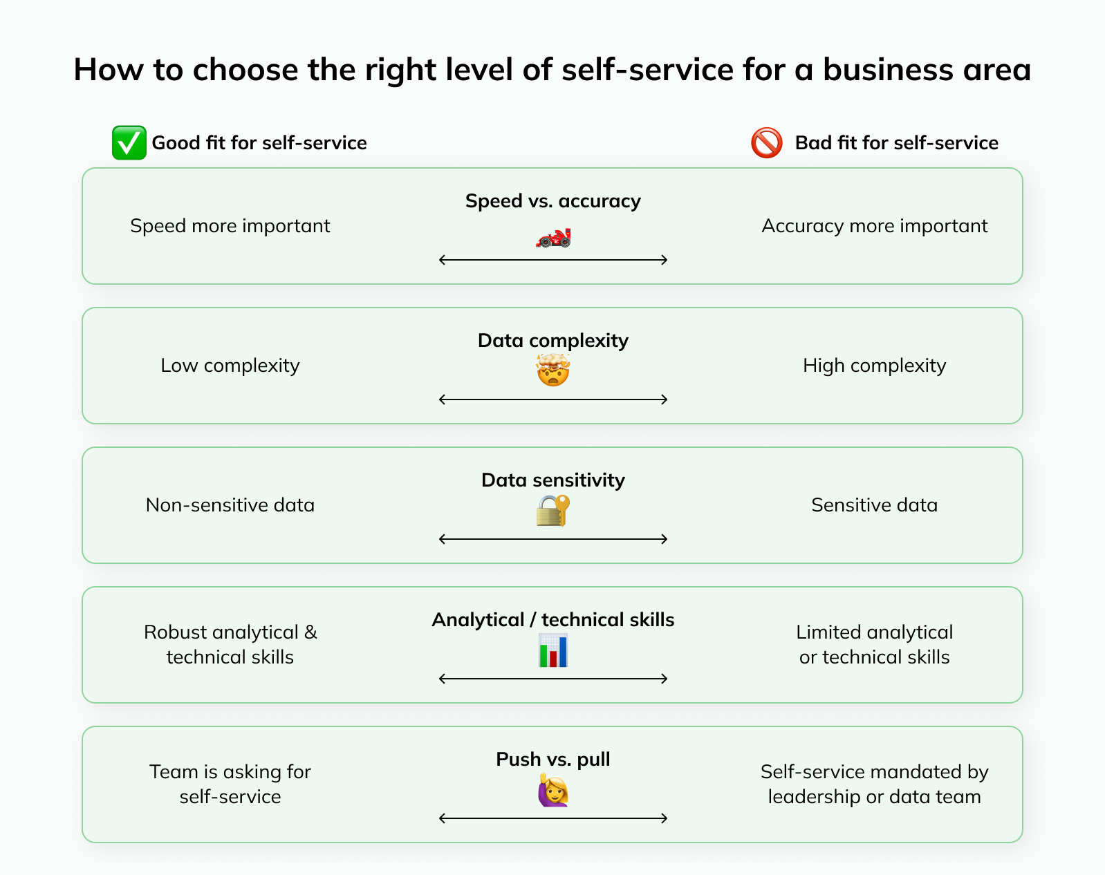
🏎️ Speed vs. accuracy: Self-service is a better fit for teams or business areas where speed is more important than perfect accuracy
Case in point: During my time at Uber, operations teams would handle all of their day-to-day analytics themselves. They needed to react to changes in the business in real-time, and directional accuracy was usually sufficient. The policy team, on the other hand, relied exclusively on a team of dedicated data scientists since all of their analyses went to regulators or the press
🤯 Data complexity: Not all data are created equal; for example, datasets can vary meaningfully in size (e.g. billions of rows in B2C ad impressions data vs. thousands in B2B customer data) or complexity (e.g. complex geospatial data in ridesharing vs. e-commerce orders). While you can simplify things in many cases, there is a limit to what users without formal data training can reliably handle
🔐 Data sensitivity: The biggest advantage of data democratization can also become the biggest potential risk, if not addressed proactively: The number of people with access to data increases, resulting in a higher risk of leaks or misuse. It’s key to manage this risk by setting the right permissions; for example, access to employee data should likely be limited to select teams or even individuals, and this should be strictly enforced and monitored through processes and tooling
📊 Analytics / technical skills: Some non-data teams have higher levels of pre-existing analytical and technical skills, making it easier for them to adjust to self-service analytics. For example, engineering teams are familiar with database schemas and writing code, making it easy to get used to SQL. And teams like finance or growth marketing already work with data daily (e.g. in spreadsheets), giving them a solid foundation to build on
🙋♀️ Push vs. pull: Self-service is much more likely to succeed if teams are asking for increased data access rather than leadership or the data team deciding they should be handling more analytics work themselves
Defining the overall self-service approach
Now, let’s put this together into a unified plan. When we combine our vision for 1) which tasks and 2) which business areas or teams we want to prioritize for self-service, we get a matrix like this that lays out our approach:
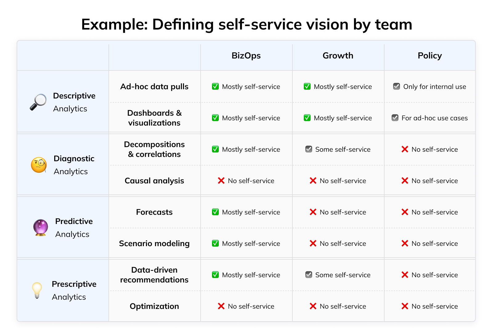
Being explicit about the scope of your self-service effort like this has a few key benefits:
Clear expectations: Roles and responsibilities are agreed-upon upfront, and it’s easy to track whether you’re making progress towards your goal
Planning & focus: You know what level of resourcing you’ll need to support the roll-out and you can focus on the right enablement efforts to make it successful (we’ll dig into that in the next sections)
2️⃣ Providing safe, frictionless data access #
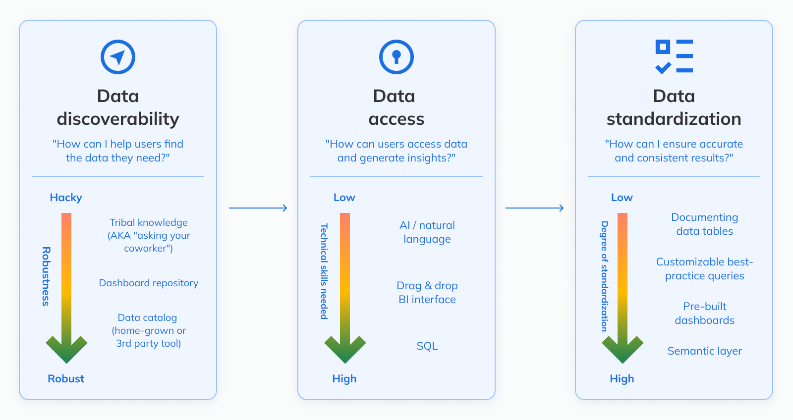
If you want people to actually take advantage of self-service, you need to make it easy for business stakeholders to 1) find data and 2) access it.
Making it easy to find data
At a small 5-person startup, finding data is as easy as walking over to your co-worker’s desk and asking them. But as your company grows and the number of “BI creators” increases due to data democratization, you need a systematic way to create visibility into analytics resources.
If users are unaware and recreate something that already exists, it doesn’t just waste valuable time, but also increases confusion — now there’s another dashboard to choose from.
This problem can be addressed in three layers:
Reducing data fragmentation: If data lives in fewer places, it’s easier to find (and keep consistent). Streamline your data stack and encourage users to stick to one tool for a particular use case, if possible. For example, except for ad-hoc reports, keep all major GTM dashboards in the BI tool instead of Salesforce; this also makes it easier to look at your pipeline data alongside things like web traffic or customer support requests that likely live outside of your CRM but are relevant to the full picture
Making data discoverable: As a startup, it’s usually unrealistic to maintain a comprehensive and perfectly up-to-date data catalog. However, even a simple repository with links to the most important dashboards is a helpful start. Over time, this can then evolve into a more robust resource with detailed metadata etc., either homegrown (e.g. Airbnb and Uber built their own catalogs) or by leveraging a dedicated tool
Publishing / highlighting vetted resources: Users need to know which resources are the most reliable as they have been created or vetted by the data team. You can implement this through a formal mechanism in your BI tool, or in a hacky fashion (e.g. color-coding in a spreadsheet)
Making it easy to access data
Once biz stakeholders know where to find data, the next step is making it easy to actually access it and derive insights. The most important thing to keep in mind: Changing human behavior is hard.
That means if you want to maximize self-service participation, you need to meet business users where they are instead of forcing them to use completely new tools or workflows.
Every bit of friction you add to the process, or new skill you require users to learn, increases the risk that they will give up and your data democratization effort fails.
That doesn’t mean that you should just look at your least technical stakeholder and tailor your approach to them. Instead, offer multiple ways to access data so that each group of stakeholders can pick the interface that works best for them. Depending on your data stack, these interfaces could be part of one or multiple tools.
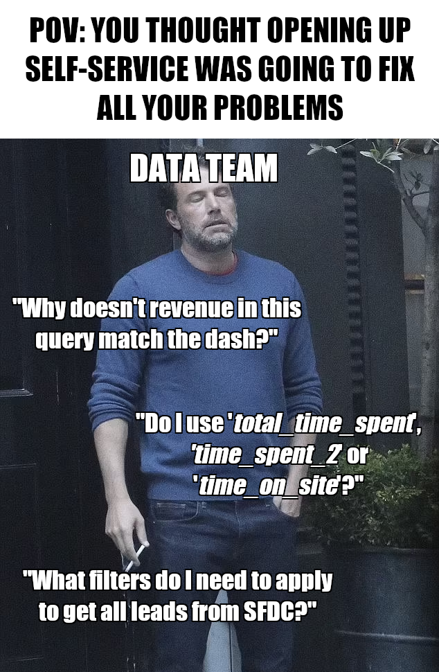
A word of caution, though: Frictionless data access is great for speeding up time to insight, but without a thoughtful set-up and oversight, it will quickly lead to chaos and confusion. People will use the wrong fields or different metric definitions, and you’ll start drowning in Slack pings:
The only way to prevent this is to create resources and guardrails that remove ambiguity and reduce the mental load for users trying to get insights. As we’ll go through the different interfaces below, we’ll dive deeper into the specific things you can do.
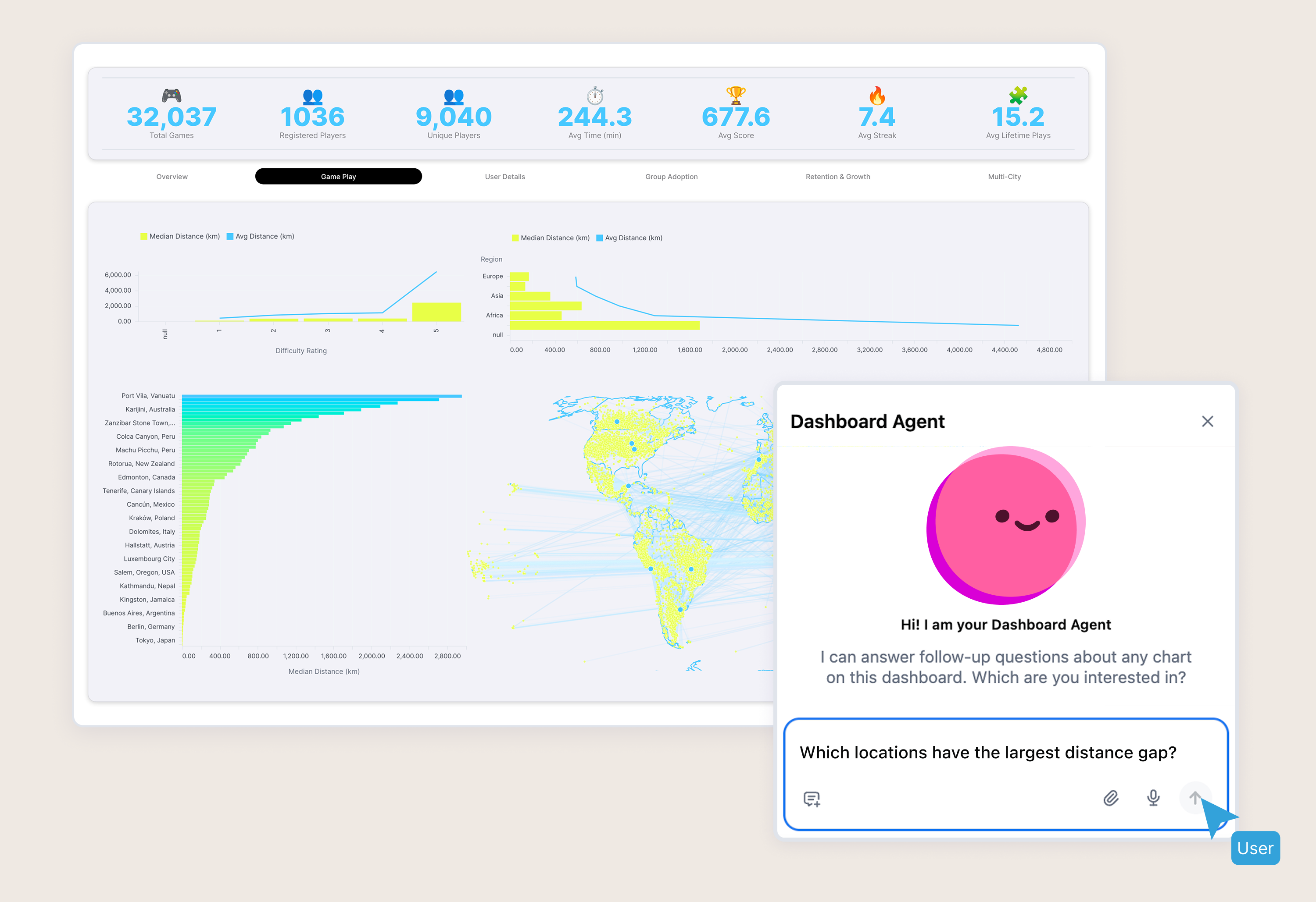
Natural language (AI)
For many stakeholders, the most familiar way to request data and insights is natural language as that’s how they’re currently operating (creating tickets, sending Slack messages, or talking to data team members in-person).
Of course, in a self-service model, we need another entity that plays the data team’s former role: Translating natural language requests into SQL to pull data, and then translating the query output into insights for stakeholders.
LLMs can play this role well. They allow users to ask questions the way they would normally pose them to the data team, get answers almost instantly, and then ask follow-up questions or request summaries and visualizations.

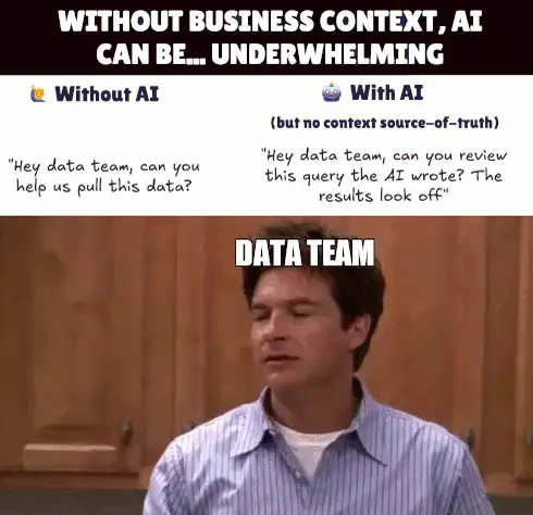
However, for this to work reliably, the AI needs business context. Without it, similar to a human user, it doesn’t understand all of the company-specific nuances that weren’t in its training data.
For example:
Which custom Salesforce fields to use under what circumstances
Whether to distinguish countries based on the location of the customer, the sales rep, or the contract currency
How to define an “active” user for a particular use case
This is why semantic layers have gotten a lot of attention in recent months: They provide a central source of truth that defines business logic, which can create a shared vocabulary for humans and AI. Semantic layers can either be part of your BI tool, or sit as a separate layer between the data warehouse and any front-end tools and applications that consume the data.
In the absence of a fully-fledged semantic layer, you should still document key metrics definitions and make this context accessible to the LLM. The more context you provide (e.g. concrete examples of when to use one metric over another), the better.
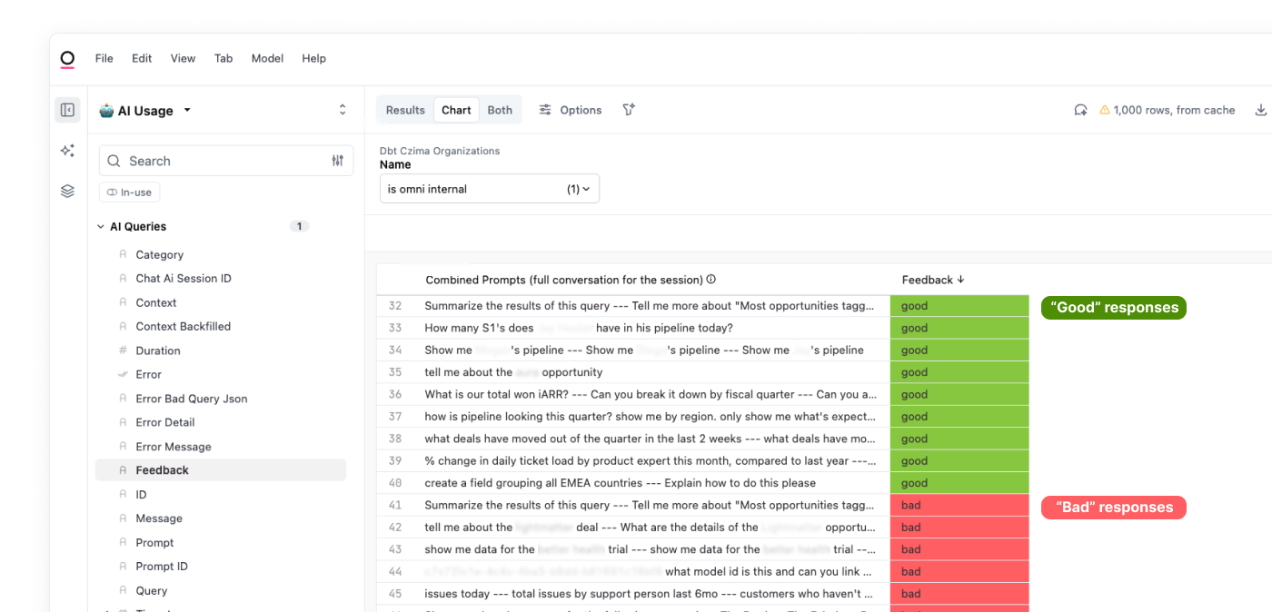
Unfortunately, even if you provide comprehensive context, LLMs can still be unpredictable. For example, most LLMs are not in the habit of asking clarifying questions by default, so if a user query is ambiguous, they might misinterpret it.
You can mitigate some of these issues by 1) providing custom instructions that promote desired behaviors and 2) closely monitoring response quality.
However, it's impossible to guarantee the exact answer a user will get, so it's important to remind your stakeholders to critically evaluate and sanity check outputs using the nuanced business context they have.
We'll dive more into this in the next section (“Educating business stakeholders”) below.
Drag & drop BI tools / dashboards
While natural language provides easy access, it doesn’t make other interfaces obsolete.
Many users prefer more direct control over the data they’re analyzing without necessarily wanting to write SQL, and sometimes, selecting a few filters or toggles in a graphical user interface is simply more efficient than describing exactly what you want.
For these users, a BI tool with a drag & drop interface is a good fit. However, there are a few key considerations:
If users build dashboards from scratch and you don’t have a means of ensuring everyone is using the same “correct” metric definitions, you’ll likely end up with regular requests to the data team to reconcile inconsistent data between reports
And even if definitions are correct initially: Once they change over time, they’ll have to be manually updated in every dashboard, which is difficult to stay on top of in a democratized data set-up with dozens of dashboard owners
Some of this can be addressed by building “vetted” dashboards for the most common use cases that allow users to explore the data via drilling and filters. However, this partially defeats the purpose of data democratization (removing the data team as the bottleneck) and you likely won’t be able to keep up with demand, so sooner or later you’ll find yourself looking for a more scalable solution.
Another issue to get ahead of: Many users will export data into spreadsheets at some point in their analysis since that’s the environment they’re most familiar with.
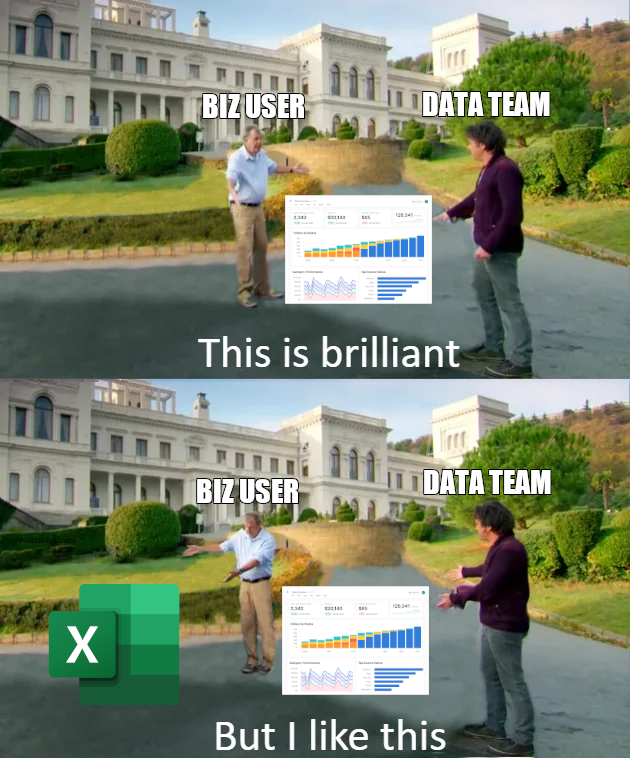
This is understandable, but contributes to more data fragmentation. Luckily, modern BI tools have responded by incorporating spreadsheet functionality and Excel-like formulas to provide a familiar environment for these users, reducing the incentive to move data out of the tool.
Keep this in mind as you’re choosing the tools for your self-service effort: The lower the barrier to entry, the more likely it is that users will actually use them; and the fewer tools are being used, the easier it is for you to put guardrails in place and monitor how things are going.
SQL
Lastly, some of your more technical users will want to write raw SQL.
Among the different ways to access data, this one has the largest room for user error and metrics inconsistencies, so addressing these risks proactively is especially important. But, for many power users it’s their preferred way to interact with data, so you’re best off accounting for it upfront.
You can do this in a number of ways, from hacky to more robust:
Documenting data tables: Well-documented tables make it easier for users to understand which fields to use for what. However, they still need to figure out large parts for themselves (e.g. which filters to apply), leaving room for error
Providing customizable best practice queries: Vetted queries can be a great starting point for SQL users of all skill levels (e.g. even SQL novices can get custom results by adjusting date ranges and commenting-in/commenting-out certain filters). However, these repositories often become difficult to maintain as definitions change over time
As your organization and the number of data users grow, this can lead to chaos and confusion. As a result, many data teams eventually decide to put more governance in place and create a metric source of truth — such as dbt, a semantic layer, or both.
Finally, opening up SQL to a broader user base comes with a risk of performance degradation and increased data warehouse bills. During my time at Uber, most SQL users didn’t have extensive formal data training. As a result, we’d regularly have instances where massive queries on raw data tables were running for hours before timing out while other ad-hoc queries were sitting in the queue.

So if you democratize access, make sure you put monitoring in place that flags queries with outsized resource usage so you can share query optimization best practices with the owners.
—
For easier reference, here is an overview of the different ways we discussed that you can:
help users discover data
help users access data and make sense of it, and
standardize definitions and provide context to ensure accurate and consistent results, both for AI and human users
This might seem daunting, but the good news is: You don’t have to document or model every metric in your business to start your democratization effort. In fact, you shouldn’t; otherwise you’d be spending weeks or even months just preparing without getting any business impact. Also, your data will constantly evolve — you’ll add new data sources, and metric definitions will change.
If you try to anticipate all of this and put a perfect foundation in place, you’ll never start.
Instead, based on your assessment of where each business unit falls on the Speed vs. Accuracy trade-off discussed above, you can start by focusing on the most critical use cases. Then, you can iteratively build out your repository of vetted resources or your metrics layer over time. Based on the feedback and data you collect from your early self-service users (e.g. the most common questions you get, fields that are queried the most etc.), you’ll be able to do a much better job than if you tried to tackle this all in advance.
3️⃣ Educating business stakeholders #
Above, we covered the things that you — the data team — can do to facilitate frictionless and safe data access. However, the other piece of the equation are the users.
Now that they’re self-serving many of their data needs, your stakeholders need to know:
How to structure an analysis or investigation
How to get the most out of data tools
How to QA and critically evaluate data
Structuring an analysis or investigation
If business stakeholders can’t get the answers they need, they’ll eventually lose motivation for self-service and start directing all of their questions at the data team again.
In my experience, the main reason this happens is when investigations lack structure and go in circles instead of producing actionable insights. Business users often didn’t have a chance to develop this skill-set since they used to outsource this work to the data team, so it’s up to you to provide guidance and share best practices.
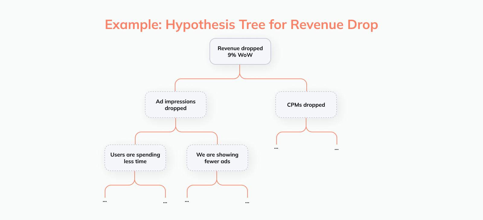
The framework I’ve found most helpful for this is the Hypothesis Tree. It gives visibility into the various areas that need to be investigated and makes it easy to both track progress and ensure you don’t forget anything.
How this works is best illustrated with an example: Let’s say a business user looks at a dashboard and notices that ad revenue dropped by 9% week-over-week. To figure out what happened, we need to decompose our target metric and rule out potential root causes one-by-one
Decomposing the metric of interest: Ad revenue can be split into Ad impressions and CPM (price x volume); as a next step, Impressions can then be decomposed into Time spent and Ad impressions / hour, and so on
Segmenting the data: Cutting the data by various dimensions like geography, product lines, user demographics etc. allows us to see if the decrease is isolated to a particular part of the business
Once this structure is laid out, it’s easy for the user to translate it into the toggles and filters they need to apply to a dashboard, or the questions they need to ask the AI assistant in the BI tool.
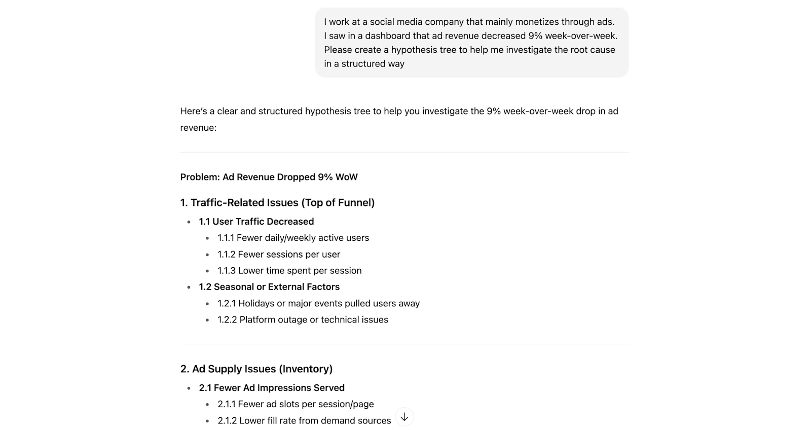
Note: Many people take a while to really internalize this type of approach. LLMs are a great way to speed things up and help users practice hypothesis generation. Here is an example using ChatGPT:
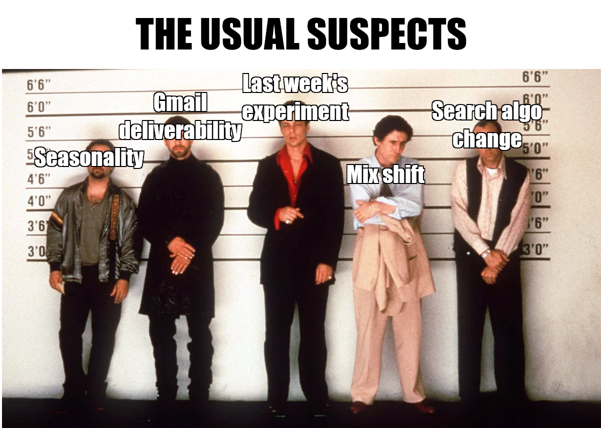
Lastly, many investigations repeat over and over again. To avoid reinventing the wheel every single time, it’s helpful in my experience to keep a repository of past investigations that people can reference to quickly identify “the usual suspects”.
To start, this can be as simple as a spreadsheet that links out to old investigation docs. Then, if a certain type of investigation keeps happening and you think it’s worth the effort, you can flesh this out into more robust investigation playbooks.
How to get the most out of data tools
Most of us know the data tools we work with like the back of our hands because we work with them on a daily basis. Most of your self-service users will have much less experience, though.
Office hours or Slack channels can be helpful to handle any questions that come up as users are digging in. However, this likely isn’t enough. It’s difficult to know what you don’t know, so users are almost guaranteed to miss out on some features simply because they didn’t even realize they existed.
This is where it pays off to be proactive. First, conducting hands-on live training sessions (and recording them for later reference) goes a long way. Documentation often focuses on functionality and users tend to skim over it; but during a training session, you can show a real self-serve use case end-to-end which makes things much more tangible and shows the value they can get out of the tool.
And if your BI tool has user analytics, it can help you judge how the self-service roll-out is going: You can see who’s logging in and who isn’t, what features are being used, etc.
Based on this data, there are several things you can do. For example:
Identify power users and leverage them as champions (e.g. document and share their best practices, have them join office hours or training sessions and share their insights, etc.)
Flag users that aren’t using the tool, or where usage is dropping off, so you can reach out and help them get over any hurdles to adoption
Understand which features users aren’t taking advantage of, and conducting training sessions on those specifically
How to critically evaluate data #
Despite your best efforts in terms of documentation and data modeling, you won’t be able to make things foolproof. Users might still make mistakes, and AI assistants can give inaccurate answers — especially when they don’t have the context of your business or full context of the question.
As a result, it’s important for business users to know how to critically evaluate the data they’re working with.
At a (very) high level, this involves two steps:
Step 1: Assessing the inputs
It’s unrealistic to expect everyone to apply the same rigor as data engineers or scientists when it comes to QA of a dataset. However, it still makes sense to encourage them to understand what the source data looks like before diving into the analysis.
For example: Let’s say a user wants to do an analysis on funnel metrics for different marketing channels. Before creating the desired summaries and visualizations, they should, at a minimum, do basic checks like:
Is there an unexpectedly high number of NULL values in the data? This might suggest a data issue that needs to be investigated
Is there a small set of standardized values for lead sources, or will they need to clean and group them first?
What are the different opportunity stages, and which ones are relevant for the analysis?
This is a great use case for AI if your BI tool has this capability:
Step 2: Sanity checking outputs
Checking inputs to an analysis is important (we all know: “garbage in -> garbage out”), but it won’t guarantee that your users are getting the “right” result — especially if AI is involved.
Before they share the data more broadly or make decisions based on it, they need to pressure test the output. Here are two best practices that are easy to apply and can catch the majority of issues:
Check #1: Compare results to known sources of truth
Even if there is no vetted resource showing the exact data cut a user is working with, it’s often still possible to make a comparison. For example, if you’re analyzing specific groups of leads, you can check if the total number of leads matches existing dashboards and reports. If it doesn’t, it’s a strong signal that the more granular data you’re looking at can’t be trusted either.
Check #2: Benchmarking / gut checking
Sometimes, there isn’t a source of truth you can leverage at all. However, you can still figure out if you’re in the right ballpark.
For example, you can apply gut checks:
Is the number of Daily Active Users you pulled at least two to three times smaller than the number of Monthly Active Users you looked at last week?
Does your user base by country reflect the relative size of those markets?
In addition, you can check with subject matter experts on your team. Nobody ever has all the relevant context; and sometimes, when you’re in the weeds of an analysis, it’s easy to miss the forest for the trees. Teammates will often be able to provide a sanity check with a fresh set of eyes or give additional context that might explain a surprising metric movement.
Alternatively, you can use external benchmarks; a quick Google Search (or ChatGPT query) will provide averages and ranges for the most common metrics like conversion rates, margins, or efficiency ratios.
4️⃣ Expanding data democratization iteratively #
With all your pieces in place, you’re ready to get going. But: Regardless of how much excitement there is for self-service, it’s usually not a good idea to roll it out broadly across the company at the same time.
There will be friction points and challenges to work through, and a large-scale roll-out will make it difficult to tackle these before they spiral out of control. It’s easier to ask a team to wait a few more weeks for access than to take it away after they got used to it:

So instead of an instant company-wide roll-out, pick one or two teams for a pilot. In addition to being good candidates for data democratization based on the criteria covered earlier in this post, these teams should check a few other boxes as well:
They have at least one analyst profile on their team: Having a decentralized champion that can answer some of the team’s questions and promote adherence to best practices will make your life much easier
It’s a small team: Interfacing with a limited number of stakeholders means you can give personalized attention to everyone and can respond to people’s issues more quickly
They have a high volume of ad-hoc requests / questions: The goal of the pilot is to get a lot of learnings in a short amount of time. The more the teams (want to) use data, and the more varied their use cases are, the more valuable insights you’ll generate
Speaking of monitoring: The pilot is your opportunity to monitor how users engage with data and the issues they encounter, and then iteratively improve the experience. For example:
Monitor AI interactions and the quality of responses and add missing context for common issues
Track the most common questions posed to AI and the most common query use cases so that you can create a source-of-truth dashboard for them down the road
Observe which fields are queried most frequently and prioritize these for metrics standardization (e.g. via your semantic layer)
Then, once you feel like you have enough data on usage patterns and the biggest issues are ironed out, you can slowly open up access to more teams.
TL;DR #
Self-service analytics can be a win-win for the data team and business stakeholders.
But for it to work, you need to implement it thoughtfully and treat it as an evolution of the cross-functional partnership rather than an opportunity to remove the data team from the equation.
At a minimum, you should:
Clearly define the vision for self-service: What is your motivation and ultimate goal? For what use cases across which teams do you plan to implement self-service access?
Offer easy data access: Don’t forget that your users come from different backgrounds and skillsets; it’s your job to meet them where they are by offering various ways for everyone to get the answers they need
Put governance in place to prevent metrics chaos: To enable your stakeholders to get answers and minimize confusion, you need to create data foundations that make standardized metrics available to everyone (did I mention semantic layers? 😉)
Educate your stakeholders: Business users need support to work through analytics questions end-to-end, from structuring analyses and sanity-checking data to navigating the various BI tools
This might seem like a lot of upfront effort at first glance, but remember: You don’t have to launch self-service for all teams and use cases at once, or have perfect governance in place to get going. Start with a small pilot, test what works, and then gradually roll things out more broadly.
Want more frameworks & news from our team? Subscribe to our newsletter to become omniscient 😉