Key takeaways #
Chart selection should start with the business question, not with a favorite chart type. A sorted bar chart answers "which regions missed target?" in ways a pie chart never can.
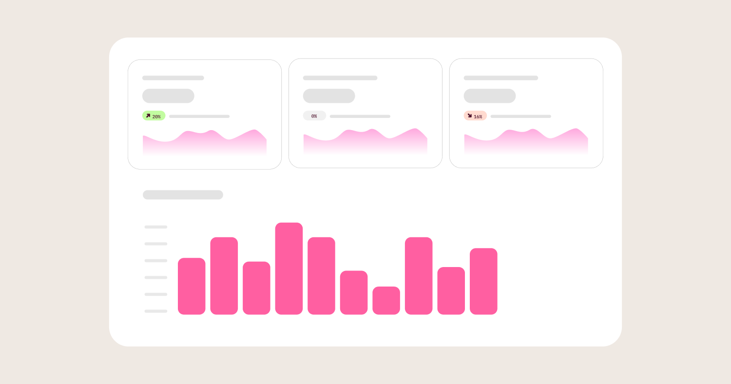
Dashboard layout determines scanning speed. Place headline KPIs and critical exceptions at the top. Group related metrics together. Limit each view to six to eight charts.
The most common visualization mistakes are truncated axes, dual-axis charts implying false correlation, inconsistent color meaning, and missing labels or definitions.
Executive, operational, and analyst dashboards serve different decision types and require different chart choices, density levels, and refresh cadences.
Dashboard trust breaks when the same metric name means different things on different dashboards. Visual polish cannot fix a governance gap.
A semantic layer provides the foundation needed to ensure consistent results across dashboards and prevent metric drift.
A pre-publish dashboard review checklist covering decision intent, chart-to-task fit, hierarchy, clutter, and semantic consistency prevents the most common dashboard failures.
Quarterly dashboard performance reviews catch metric drift, identify abandoned dashboards, and keep the portfolio focused on active business questions.
TL;DR #
Data visualization best practices are not about aesthetics. They are about helping teams reach correct conclusions faster. The most important practices are matching each chart to a specific analytical question, designing layouts for fast scanning, avoiding common mistakes that distort interpretation, and enforcing consistent metric definitions so every dashboard tells the same truth.
Why data visualization matters for decision-making #
A chart can use accurate data and still mislead. The visual encoding, the scale, the labels, and the comparison context all shape how viewers interpret a number. When those elements are poorly chosen, teams draw the wrong conclusions from correct data.
Nguyen et al. (2021) identified recurring categories of visualization pitfalls in published research, including inappropriate chart types, distorted scales, and missing context. These pitfalls are not limited to academic papers. They appear on business dashboards every day.
The European Union Open Data Portal (2023) found that data visualizations can clarify complex topics but can also mislead viewers, even when the underlying data is accurate. A chart is not a neutral window into the data. It is an argument. The chart type, the baseline, the colors, and the labels all frame how the viewer understands the number.
The distinction between a chart that informs and a chart that misleads is not about accuracy. Both use correct data. The difference is whether the visual encoding leads the viewer to a proportionate conclusion. A chart that makes a small change look dramatic is not wrong. It is dishonest. The EU data portal makes this point directly: the responsibility of a visualization is not just to present data but to present it in a way that supports fair interpretation.
This matters because dashboards drive real business decisions. A bar chart with a y-axis starting at 95 instead of 0 can make a two-percentage-point improvement look like a 40% surge. Teams overreact. Resources get redirected. And the underlying data was never wrong.
Visualization quality is not a design preference. It is a decision quality problem. Poor chart choices reduce confidence. Misleading scales trigger overreaction. Missing context invites debate instead of action. Every dashboard is a decision system, and every design choice either supports or undermines the decisions it produces.
Dashboard abandonment is one visible symptom. Teams build dashboards that get viewed twice and then forgotten. The root cause is usually a mismatch between the dashboard's design and the viewer's actual decision process. A dashboard based on available data rather than user needs will answer questions nobody is asking.
Another symptom is the reconciliation meeting. Two teams look at the same metric on different dashboards and see different numbers. Instead of acting on the trend, they spend the meeting debating which number is right. The chart was never the problem. The metric definition was.
The practices in this guide address the full chain: selecting the right chart for the question, arranging dashboards for fast scanning, avoiding mistakes that distort interpretation, designing for different audiences, and enforcing the consistent metric definitions that make dashboards trustworthy at scale.
A common objection to investing in visualization practices is that the data speaks for itself. It does not. The same dataset can tell opposite stories depending on the chart type, the scale, and the comparison context. A line chart with a twelve-month window shows a recovery. The same data with a three-month window shows a decline. The data did not change. The framing changed. And the framing is a design decision.
The distinction between a dashboard and a report matters here. A dashboard is a persistent, frequently refreshed view designed for repeated monitoring of the same metrics. A report is a point-in-time analysis that answers a specific question. Teams typically consume it once. Applying report design to dashboards, such as packing dozens of charts onto one screen to tell a complete story, produces cluttered views that fail at monitoring. Dashboards should let a viewer assess status in under ten seconds. Reports can take longer because they serve a different purpose.
A practical way to frame this: before reviewing any dashboard's visual design, ask whether a first-time viewer would reach the correct conclusion and know what action to take. If the answer is uncertain, the design needs work. The checklist later in this article provides a structured pre-publish review process.
How to choose the right chart for your data #
Chart selection should start with the business question, not with a default chart type. A chart that works well for trend analysis can be the wrong choice for a category comparison. The analytical task determines the visual form.
Most BI tools default to a bar chart or a table when a user starts building a visualization. This default is not a recommendation. It is a starting point that teams should change based on what they are trying to communicate. Teams that accept the default without evaluating whether it matches their analytical question produce dashboards that display data without supporting decisions.
Chart selection should begin with purpose and audience. Tableau (2024) recommends starting with three questions: what is being answered, who needs the answer, and what action should follow. The University of Missouri UDAIR (2023) organizes chart selection by analytical task, mapping comparison types to chart types. Both sources lead to the same principle: the question comes first.
A common mistake is choosing a chart type because the tool defaults to it or because the team has always used it. Pie charts persist on dashboards not because they are effective but because they are familiar. Line charts appear on reports with categorical, non-sequential x-axes not because they fit the data but because someone dragged the wrong chart type and did not reconsider.
The chart selection matrix below maps common business questions to the chart type that best supports each analytical task. Use it as a reference when building or reviewing any dashboard.
Chart selection matrix #
Analytical question | Best chart type | Why it works | Avoid |
How did this metric change over time? | Line chart | Shows trend shape, momentum, and inflection points | Pie chart, bar chart for continuous time |
Which categories are highest or lowest? | Sorted bar chart | Enables direct magnitude comparison across categories | Pie chart (hard to compare slices), line chart (implies sequence) |
Do two variables move together? | Scatterplot | Reveals correlation, clusters, and outliers | Dual-axis line chart (implies false causation) |
What is the composition of this total? | Stacked bar or treemap | Shows part-to-whole relationships | Pie chart with more than five slices |
What is the exact value for a specific row? | Table with conditional formatting | Delivers precision for operational lookup | Any chart that requires visual estimation |
Where are exceptions or thresholds breached? | KPI card with conditional color | Surfaces critical signals immediately | Dense dashboard with no hierarchy |
When your stakeholder asks "how did signups change after launch?" #
Use a line chart for continuous metrics tracked daily, weekly, or monthly. Lines reveal trend shape, momentum, and inflection points that bar charts obscure. Add a reference line for the target or prior-period comparison so viewers can assess performance without opening a second report.
Use a bar chart instead when the x-axis represents discrete, non-sequential periods. Monthly revenue totals are often better shown as bars than lines, because bars emphasize magnitude while lines imply smooth continuity between data points.
Add annotations to line charts at inflection points. If a product launch, pricing change, or marketing campaign drove a visible shift in the trend, label it directly on the chart. Annotations prevent the viewer from guessing why the line changed and reduce follow-up questions in review meetings.
When showing multiple time series on one line chart, limit to three or four lines. Beyond that, the chart becomes difficult to read. If you need to compare trends across more than four categories, use small multiples instead of overlapping lines.
When your stakeholder asks "which regions missed the target?" #
Use a sorted horizontal bar chart with a vertical reference line at the target value. Bars that fall short of the line are visible at a glance. Sort descending so the worst performers appear at the top.
Horizontal bar charts outperform vertical bars for category comparisons because they accommodate long labels without angling or truncating text. Sorting by value rather than alphabetically lets viewers identify the highest and lowest performers instantly.
Color-code bars to add a second layer of information. Gray for bars above target. Red for bars below. This transforms a simple ranking into a performance assessment. The viewer sees both which regions are lowest and which ones missed their specific targets.
When presenting category comparisons to an audience that needs to act on the results, include the numeric value at the end of each bar. This eliminates the need to estimate from the axis and speeds the transition from "seeing" to "deciding."
When your stakeholder asks "do response time and churn move together?" #
Use a scatterplot when exploring the relationship between two numeric variables. Each point represents one observation. Clusters indicate patterns. Outliers appear as points far from the group.
Add a trend line only when you have a hypothesis about the relationship. Without a trend line, the chart still surfaces anomalies that warrant investigation. Points far from the cluster are the outliers worth examining.
A bubble chart extends the scatterplot by adding a third variable as bubble size. Use this when you need to compare three numeric dimensions simultaneously, such as deal size, sales cycle length, and probability of close. Keep the number of bubbles manageable. More than 30 bubbles on one chart makes the view cluttered.
Do not use a dual-axis line chart for relationship questions. Dual-axis charts plot two metrics with independent y-axis scales in the same frame. The scales can be adjusted to create any apparent pattern, which makes coincidental alignment look like causation.
When your stakeholder asks "how is revenue split across product lines?" #
Use a stacked bar chart or treemap for part-to-whole composition when there are fewer than seven categories. Treemaps work well for showing relative size at a glance. If stakeholders need to compare exact values between categories, switch to a grouped bar chart. Area comparisons in treemaps are imprecise.
Avoid pie charts with more than five slices. Humans judge angles and areas poorly. A 22% slice and a 27% slice are nearly indistinguishable in a pie chart. A sorted bar chart makes the five-point gap visible immediately.
When exact values matter more than patterns #
Use a table with conditional formatting when stakeholders need to look up specific rows, such as overdue invoices, account balances, or daily error counts. Tables outperform charts for operational decisions where the action depends on a precise number.
Add conditional formatting, such as red text for values above a threshold, to preserve some scanning speed. A table without formatting is a spreadsheet. A table with formatting is a decision tool.
When your stakeholder asks "where is the drop-off in our signup funnel?" #
Use a horizontal funnel chart or a waterfall chart to show sequential drop-off across stages such as visit, signup, activation, and purchase. Label each stage with both the absolute count and the stage-to-stage conversion rate.
Funnel charts work because they make the largest drop-off visually obvious. A 60% drop between signup and activation jumps out when the bar shrinks by more than half. The viewer immediately knows where to investigate.
Avoid vertical funnel charts when stage names are long. The labels become difficult to read. Horizontal funnels accommodate text better and read naturally from left to right.
When presenting funnel data to a team that needs to act on the drop-off, highlight the largest gap between stages. A conversion funnel where 80% of visitors sign up but only 15% activate has a clear action point. The chart should make that gap the visual focal point, not require the viewer to calculate it from the raw numbers.
When exceptions need immediate attention #
Use KPI cards with conditional color for status indicators and threshold alerts. A single number with a green or red background communicates "on track" or "needs attention" faster than any chart.
Place KPI cards at the top of the dashboard. Group them by decision area. These cards set the context before the viewer moves to the detailed charts below.
Charts the standard guides ignore #
Several chart types rarely appear in basic visualization guides but solve real problems in business dashboards.
Sparklines are small, inline line charts placed next to a KPI value. They show the recent trend without requiring a full chart. An executive dashboard with a revenue number and a sparkline showing the trailing 12-week trend communicates both the current value and its direction in a single row.
Bullet charts replace gauges and dials. A bullet chart shows a current value, a target, and performance bands in a compact horizontal bar. They use far less space than gauges and are easier to compare across multiple metrics.
Small multiples display the same chart repeated across categories, such as one line chart per region or one bar chart per product. They enable fair visual comparison without the clutter of overlaying multiple series on one chart. When a dashboard needs to compare trends across eight regions, eight small multiples are clearer than eight lines on one chart.
What are dashboard layout best practices? #
Dashboard layout determines how quickly a viewer can find the most important signal. A well-arranged dashboard lets someone assess status in five seconds. A poorly arranged one forces them to search.
The University of Missouri UDAIR emphasizes reducing cognitive load as a core design principle. Cognitive load is the mental effort required to process information. A dashboard that requires less cognitive load produces faster and more accurate decisions. Every layout choice either reduces or increases the viewer's processing burden.
The following rules reduce cognitive load and support faster decision-making.
1. Place headline KPIs and critical exceptions first #
Viewers look at the top-left corner of a dashboard first. Place the most important signal there. On executive dashboards, this is usually a headline KPI with comparison to target or prior period. On operational dashboards, it is the current status or the most urgent exception.
Do not bury critical information below the fold. If a viewer has to scroll to find the number that drives their next action, the layout is wrong.
Consider how the dashboard will be consumed. If it will be projected in a meeting room, increase font sizes and reduce density. If it will be viewed on a laptop, design for the default browser width. If it will be screenshotted and pasted into a Slack message or slide deck, make sure the key message is visible in a cropped screenshot without surrounding context.
2. Group related metrics together #
Proximity signals relationships. Place metrics that answer the same question in the same visual group. Separate groups with whitespace or section headers, not borders or heavy lines.
When a viewer's eye moves from a revenue chart to a cost chart and then to a margin chart, the layout is doing the analytical work. When it jumps from revenue to support tickets to NPS to margin, the viewer spends energy on context-switching instead of pattern-recognition.
Use clear section headers or subtle background shading to define groups. A "Revenue Performance" group containing revenue, cost, and margin charts tells the viewer these metrics are related before they look at any data point. Grouping by topic reduces the cognitive effort required to understand the dashboard's structure.
3. Design for comparison, not decoration #
Every chart on a dashboard should include comparison context. A number without a benchmark is a fact. A number with a benchmark is an insight. Add targets, prior-period values, or peer comparisons to every metric where they are available.
Remove decorative elements that compete for attention. 3D effects, gradient fills, and ornamental icons reduce the signal-to-noise ratio. A clean dashboard with clear comparisons earns more trust than a visually elaborate one that hides the answer.
The most effective comparison context is a reference line or shaded band on the chart itself. A revenue line chart with a dashed target line communicates "above plan" or "below plan" without requiring a separate chart or mental calculation. A bar chart with a prior-period comparison bar next to each current-period bar shows change at a glance.
4. Limit each view to six to eight charts #
Practitioners consistently recommend limiting dashboards to eight to ten charts on a single view. The problem is competing focal points. When every chart demands equal attention, none of them stand out.
Identify the three to five decisions the dashboard should support. Include only the charts that directly inform those decisions. If a chart does not change what the viewer does next, remove it. Split specialized analyses into separate tabs or linked dashboards organized by audience.
5. Use consistent date ranges and filters #
Apply the same default time range to every chart on a dashboard. If one chart shows trailing 90 days and another shows year-to-date, viewers compare mismatched data without realizing it.
Use a single global filter for date range, region, or segment. Label the active filter prominently. When a viewer shares a screenshot from a dashboard, the date range should be visible without opening the original.
6. Make the intended action obvious #
Every dashboard should answer the question "what should I do next?" for its primary viewer. If the viewer has to interpret the data and then figure out the action independently, the dashboard is an information display, not a decision tool.
Add annotations or brief text to explain what matters. A note that says "pipeline coverage dropped below 3x target this week" next to a pipeline chart converts a data point into a prompt for action. The viewer does not have to calculate the ratio or remember the target. The dashboard does the work.
When possible, link from a dashboard signal to the next step in the workflow. An operational dashboard that shows a queue exceeding its threshold can link directly to the queue management tool. The shorter the path from signal to action, the more effective the dashboard.
What are the most common data visualization mistakes? #
The most frequent data visualization mistakes are truncated axes that exaggerate change, dual-axis charts that imply false correlation, pie charts used for ranking, overloaded dashboards, and inconsistent color meaning. Each mistake introduces decision risk by leading viewers to wrong conclusions from correct data.
These are not just design flaws. They create real business costs. Nguyen et al. (2021) found that many of these pitfalls persist in peer-reviewed scientific publications. The stakes of misinterpretation in published research are high and the review process is rigorous. If trained researchers make these mistakes, business teams building dashboards without formal visualization training will encounter them constantly.
The table below pairs each common mistake with the specific risk it creates and a concrete fix.
Mistakes and fixes #
Mistake | Decision risk | Fix |
Truncated y-axis on a bar chart | Small changes look dramatic, triggers overreaction | Default to zero baseline for magnitude comparisons |
Dual-axis chart | Implies correlation where none exists | Use two separate charts or a scatterplot |
Pie chart with 8+ slices | Ranking becomes impossible, smallest slices unreadable | Switch to sorted horizontal bar chart |
Inconsistent color meaning | Red means "bad" on one page, "current period" on another | Define a color semantics guide and enforce it |
Missing labels, units, or date ranges | Viewers debate definitions instead of acting | Label every axis, state the unit, show the time window |
Overloaded dashboard (15+ charts) | Signal buried in noise, key insight missed | Limit to 6-8 charts, split by audience |
Truncated axes that exaggerate change #
A bar chart with a y-axis starting at 95% instead of 0% can make a two-percentage-point change in customer retention look like a 40% drop. The data is accurate. The visual encoding exaggerates the magnitude.
Default to zero baselines for bar charts when the goal is to compare magnitudes. Reserve truncated axes for line charts where the trend shape matters more than absolute size. When you do truncate, label the axis clearly and note the baseline so viewers do not misread the scale.
There is one exception. When monitoring a KPI that fluctuates between 97% and 99%, a zero baseline makes meaningful variation invisible. In these cases, use a line chart with a clearly labeled truncated axis and a reference line at the target threshold. The key is to make the truncation visible and intentional, not hidden and misleading.
Dual-axis charts that imply false correlation #
Dual-axis charts create a false visual correlation between two unrelated metrics. They force two measures into the same frame with independently scaled y-axes. A marketing team that plots ad spend on the left axis and signups on the right will see the lines move together. This happens regardless of whether a causal relationship exists. The scales can always be adjusted to create any apparent pattern.
The safer alternative is two side-by-side charts with independent, labeled scales. If the goal is to test whether two variables are related, use a scatterplot instead.
Dual-axis charts are one of the most debated chart types in data visualization. Some practitioners argue they save space by combining two metrics. The problem is that they sacrifice interpretive honesty for screen real estate. The space savings are not worth the decision risk.
Pie charts used for ranking #
Pie charts fail at the one thing most category comparisons require: precise ranking. Humans judge angles and areas poorly. A 22% slice and a 27% slice look nearly identical. A sorted bar chart makes the five-point difference immediately visible.
Pie charts are only appropriate when the composition has two or three segments and the approximate proportion matters more than the exact difference. A 70/30 split is obvious in a pie chart. A 22/27/18/15/12/6 split is not.
When showing market share or budget allocation across categories, default to a sorted horizontal bar chart. Bar length is the visual dimension humans judge most precisely. Angle and area, which pie charts require, are the dimensions humans judge least precisely. This is not a preference. It is a perceptual constraint.
Overloaded dashboards that hide the signal #
A dashboard with 22 tiles covering revenue, pipeline, support tickets, NPS, and server uptime on one screen forces every viewer to search for their signal. None of the charts get enough attention. Key insights get missed.
Split overloaded dashboards by audience and decision type. Three dashboards with five to seven charts each, one for executives, one for sales operations, one for support leads, produce faster decisions than one dashboard that tries to serve everyone.
A useful rule of thumb: if a dashboard takes more than five seconds to load or five seconds to interpret, it is doing too much. The most common causes of slow dashboards are:
Unfiltered queries that scan entire tables
Too many individual queries firing on page load
Complex calculations running at render time instead of in the data model
The three highest-impact fixes for dashboard performance are moving aggregations into the semantic layer or materialized views, limiting default date ranges, and lazy-loading below-the-fold charts.
Color used without clear meaning #
Color inconsistency creates interpretation errors even when the underlying data is correct. If green means "above target" on one dashboard and "current period" on another, viewers must relearn the color system on every page.
Publish a color semantics guide for your organization. Assign fixed meaning to each color: green for favorable, red for unfavorable, gray for neutral or prior period. Enforce the guide across every dashboard. Never rely on color alone to convey meaning. Pair color with labels or icons for accessibility.
The National Eye Institute (2024) estimates that approximately 8% of men and 0.5% of women have some form of color vision deficiency. A dashboard that relies solely on red and green to distinguish good from bad excludes a meaningful portion of viewers. Use shape, pattern, or text labels alongside color. A red bar with a downward arrow icon is readable by everyone. A red bar without context is not.
Missing labels, definitions, and comparison context #
A metric labeled "active users" without a definition invites debate instead of action. One team interprets it as 30-day logins. Another interprets it as 7-day core actions. The CEO sees the number and asks what it means. Three hours of a leadership meeting are spent reconciling instead of deciding.
Label every axis. State the unit. Show the time window. Include a definition tooltip or link for every metric. If the definition is not visible, the number is ambiguous, and an ambiguous number does not drive action.
This mistake connects directly to the broader governance problem covered later in this article. Missing labels are often a symptom of missing definitions. If a data team cannot agree on what "active users" means, no label will fix the confusion. The label problem is a governance problem wearing a design disguise.
Before-and-after: the "everything dashboard" #
Consider a dashboard with 22 tiles covering revenue, pipeline, support tickets, NPS, customer churn, server uptime, marketing spend, and hiring progress. Every metric competes for attention. The CEO opens it, scans for ten seconds, gives up, and asks an analyst to pull the numbers into a slide.
The fix is not adding more charts. It is splitting the dashboard into three focused views. One for the executive team with five KPIs and trend lines. One for sales operations with pipeline detail and rep performance. One for the support lead with ticket volume, resolution time, and SLA compliance.
The total number of charts went up. The time to insight went down. Each viewer sees only what they need to make their next decision.
How to design dashboards for different audiences #
Executive, operational, and analyst dashboards serve different decision types. A single dashboard that tries to serve all three audiences typically serves none of them well. The chart choices, density levels, and refresh cadences should match the viewer's decision speed and decision type.
The most common dashboard failure is building one view for all audiences. An executive does not need the detail an analyst needs. An analyst does not need the constraints an executive view requires. Dashboard software that enforces governed metrics makes it possible to serve all three audiences from the same underlying definitions without duplicating metric logic.
Audience design guide #
Audience | Focus | Example metrics | Refresh cadence |
Executive | Direction, exceptions, strategic KPIs | Revenue trend vs. target, NPS, key initiative status | Weekly or monthly |
Operational | Monitoring, thresholds, current status | Queue depth, error rates, SLA compliance, bottlenecks | Real-time or hourly |
Analyst | Exploration, segmentation, drill paths | Cohort analysis, funnel conversion by segment, A/B test results | Daily or on-demand |
Executive dashboards should emphasize direction and exceptions #
Executive dashboards serve viewers who glance for three to five seconds, form a conclusion, and then ask a follow-up question. Design for that interaction.
Limit executive dashboards to five or six KPIs with trend lines and target comparisons. Use conditional color to surface exceptions. Include one line of explanatory context per KPI, such as "12% above Q1 target" or "declining for third consecutive month."
Remove filters and drill paths from executive views. If an executive wants to explore further, link to the operational or analyst dashboard. The executive view should answer "are we on track?" and nothing more.
Executive dashboards earn trust when they show consistent, governed metrics that leaders do not need to second-guess. When the executive view draws from the same metric definitions as every operational and analyst dashboard, reconciliation debates disappear. The executive sees the same "revenue" number the CFO sees, because both pull from one governed definition.
One common mistake with executive dashboards is including too much explanatory detail. An executive who sees a red KPI wants to know two things: how bad is it, and who is handling it. A paragraph of explanatory text below the chart slows the scan. Keep context to one line. Link to the operational dashboard for anyone who needs the full picture.
Operational dashboards should emphasize monitoring and response #
Operational dashboards serve teams that monitor status throughout the day and need to respond when thresholds are breached. These dashboards can support higher density than executive views.
Include threshold indicators and conditional alerts. Show current values against defined acceptable ranges. When an SLA metric drops below target, the dashboard should make that visible within two seconds of opening.
Operational dashboards fail when they cannot move from signal to investigation without leaving the governed environment. If a threshold alert fires but the user must export data to a spreadsheet to understand why, the dashboard is a notification system, not a decision tool.
Design operational dashboards for repeat visitors who bring different questions on different days. The primary view should surface the most important signal. Filter and drill options should let the viewer investigate without opening a separate tool. The faster a viewer can move from "something is wrong" to "here is why," the more effective the dashboard.
Operational dashboards also benefit from historical context within the current view. A current error rate of 2.3% is meaningless without knowing whether the typical rate is 2.1% or 0.3%. Add a trailing average or a normal range indicator to every operational metric. This context prevents false alarms and highlights genuine anomalies.
Analyst dashboards should support deeper exploration #
Analyst dashboards serve users who need drill paths, segmentation options, and the ability to investigate anomalies. These dashboards can tolerate more charts and more filters than executive or operational views.
The key design principle for analyst dashboards is exploration with guardrails. Analysts need the freedom to segment, filter, and drill into data. But that exploration should happen within a governed environment where the metric definitions are consistent with the dashboards executives and operators rely on. When analysts export data to spreadsheets or write ad-hoc queries outside the governed model, they create parallel analyses that may contradict the official dashboards.
Analyst dashboards need the ability to move between visual exploration and detailed data without losing governance context. Omni's workbook model supports this by combining point-and-click exploration, spreadsheet-style analysis on live data, and a SQL IDE within the same governed environment. Analysts can investigate further without creating ungoverned side analyses that contradict the dashboards executives rely on.
Photoroom's data team of three uses shared metric definitions to support dashboards for an organization of over 100 people. The same governed definitions serve executive, operational, and analyst views without requiring separate metric logic for each audience.
Why dashboard numbers don't match across teams #
The most common source of dashboard distrust is not a bad chart. It is two dashboards showing different numbers for the same metric.
When the sales dashboard shows revenue of $4.2 million and the finance dashboard shows $3.8 million, stakeholders do not debate the trend. They debate which number is right. The meeting stalls. Trust in both dashboards drops. One team reverts to a spreadsheet.
This happens because the label is the same but the definition is different. The sales dashboard counts revenue including pending contracts. The finance dashboard counts only recognized revenue, net of refunds. Both numbers are correct. Both dashboards are accurate. But the label "Revenue" means two different things, and no amount of visual polish can fix that.
The cost of metric inconsistency #
This is not a rare edge case. It is the default state of any organization that builds dashboards without centralized metric governance. Every team that creates its own reports will eventually define a shared term differently. The larger the organization, the faster the definitions diverge.
Metric inconsistency imposes three specific costs on organizations:
Reconciliation time. Teams spend meeting time arguing about which number is right instead of deciding what to do about it. This cost compounds with every new dashboard that uses the same metric name with different logic.
Dashboard abandonment. When a finance team cannot reconcile the revenue figure on an executive dashboard with the number in their own system, they stop using the dashboard. They revert to manual reporting. The dashboard becomes an artifact nobody trusts.
Decision risk. A product team defines "active users" as users who logged in within 30 days. The marketing team uses a 90-day window. The product team reports 50,000. The marketing team reports 120,000. Leadership cannot determine whether adoption is growing or shrinking.
These costs are cumulative. Each new dashboard built on ungoverned definitions adds another potential source of conflicting numbers. Organizations that tolerate metric inconsistency early find it exponentially harder to fix later, because every team has built workflows around their own definitions.
How consistent metric definitions fix the problem #
Metric inconsistency is solved not by renaming labels but by defining each metric once, centrally. Each definition should include explicit calculation logic, inclusion and exclusion rules, time windows, and dimensional grain.
A semantic layer for BI and AI provides this. It is a shared framework that defines metrics, dimensions, and business logic once so every dashboard, report, and AI query uses the same calculation. dbt Labs (2024) defines the semantic layer as "a standardized framework that organizes and abstracts organizational data into a single point of access."
With a semantic layer, "revenue" resolves to one calculation everywhere. "Active users" has one time window. Filters, permissions, and dimensional logic are consistent across every surface. Teams stop debating definitions and start debating strategy.
The impact extends beyond dashboards. When an organization adds AI-powered analytics, the AI queries the same semantic layer. The answers it returns match the dashboards. A stakeholder who asks a question in AI chat and then opens a dashboard sees the same number. Without a semantic layer, the AI works from raw data, and its answers may conflict with every dashboard in the organization.
Visual consistency alone is not enough #
Visual consistency means using the same labels, colors, units, and date logic across dashboards. It matters, but it is not sufficient. A visually consistent dashboard with inconsistent metric logic still fails.
Semantic consistency means the same metric name resolves to the same calculation, filters, and dimensional grain wherever it appears. Trust requires both. A dashboard can use the right colors, the right chart types, and the right layout, and still produce contradictory numbers if the metric definitions underneath are not governed.
A practical test: can a stakeholder move between two dashboards without encountering the same metric name with a different number? If the answer is no, the problem is semantic, not visual. No amount of chart optimization will fix it. The definitions need to be aligned at the source.
Teams that achieve both visual and semantic consistency report fewer reconciliation meetings, faster dashboard adoption, and higher confidence in data-driven decisions. The dashboards stop being artifacts that teams argue about and start being tools that teams use.
Governance as a design discipline #
Metric governance is not a data engineering task that happens before dashboards are built. It is a design discipline that happens alongside them.
Metric definition disagreements should be resolved by making both definitions explicit, not by picking a winner. If marketing defines "lead" as any form submission and sales defines it as a qualified submission, the semantic model should contain both: "Marketing leads (all submissions)" and "Sales qualified leads." Collapsing them into a single ambiguous "Leads" metric guarantees recurring arguments.
Omni's semantic model lets teams define metrics, permissions, and business logic in a single governed layer, then expose those definitions to dashboards, spreadsheets, and AI without rebuilding or reconciling. BambooHR used this approach to launch its Elite Analytics product to over 30,000 people in four months. Every user saw the same governed definitions regardless of how they accessed the data.
Dashboard performance reviews catch drift #
Metric definitions drift over time. A dashboard that was semantically consistent at launch can become inconsistent as new teams create new reports with slightly different logic.
A quarterly dashboard performance review prevents this. Review every active dashboard against three criteria. Is anyone still using it? Do the metrics match current business definitions? Does the visual design still support the intended decision?
Dashboards with fewer than five unique viewers in 90 days should be archived or consolidated. This practice prevents dashboard sprawl, where teams create new dashboards rather than updating existing ones. Dashboard sprawl produces dozens of conflicting views of the same data, each with slightly different metric logic.
A dashboard performance review should also check whether the metrics on the dashboard still match the current business definitions. A dashboard built six months ago may show "churn rate" calculated on a denominator that no longer reflects how the company counts customers. Unless someone audits this regularly, the dashboard silently becomes misleading.
Include the dashboard's primary viewers in the review. Ask whether the dashboard still answers the questions they bring to it most often. Business priorities shift. A dashboard designed for a product launch may no longer be relevant three months later. Regular reviews keep the dashboard portfolio focused and trustworthy.
The organizational dimension of metric governance #
Metric definitions are not just a technical governance challenge. They are organizational negotiations. Sales wants revenue recognized one way. Finance wants it recognized another way. Both have legitimate reasons.
The resolution is not to force one team's definition on the other. It is to make both definitions explicit, named, and governed. "Booked revenue (including pending)" and "Recognized revenue (net of refunds)" can coexist in the same semantic model. What they cannot do is share the same label.
When organizations treat metric governance as a people problem with a technical solution rather than the reverse, adoption increases. Teams that feel heard on definitions trust the platform more than teams that feel overruled.
A practical starting point for metric governance is what some practitioners call a "metric spine." Start with the 10 to 20 metrics that appear most frequently across dashboards and reports. Define each one explicitly: what it measures, how it is calculated, what it includes and excludes, and what time window it uses. Document these definitions in a shared location, ideally enforced through a semantic layer for BI and AI rather than a static wiki page. Expand from there as new metrics arise. Trying to govern every metric on day one is impractical. Governing the core 20 removes the majority of reconciliation conflicts.
The strongest visualization practices and the best chart selection and layout guidance in this article depend on the data underneath being consistent. Semantic governance is not a separate concern from visualization. It is the foundation that makes all other practices reliable.
Data visualization and dashboard review checklist #
Before publishing any dashboard, review it against these six checks. This checklist combines the practices from the preceding sections into a repeatable pre-publish process.
Step 1: Define the decision and audience #
Start every dashboard with three questions. What decision will this dashboard support? Who will use it? What action should follow? If the stakeholder cannot name a decision, they may need a scheduled report or an alert, not a dashboard.
Conduct a short pre-build interview with the primary viewer. Ask five questions: What decision will this dashboard support? What will you do if the key metric is above or below target? What time frame matters most? What comparisons do you need (to target, to prior period, to peers)? Who else will use this, and do they need the same view?
This interview takes 15 minutes. It prevents the most common cause of dashboard failure: building a view that answers a question nobody is actively asking. Teams that skip this step build dashboards from available data rather than from stated decision needs. The result is a dashboard that looks complete but gets abandoned within weeks because it does not connect to any workflow.
Step 2: Match chart types to the analytical task #
Select each chart based on the comparison type, not on personal preference or tool defaults. Use the chart selection matrix earlier in this article as a reference.
For each chart, verify that the chart type matches the viewer's question. A line chart answers "how did this change?" A bar chart answers "which is highest?" A scatterplot answers "are these related?" If the chart does not match the question, the viewer will misinterpret the data.
Check for anti-patterns at this step. Are there any pie charts with more than five slices? Any dual-axis charts? Any bar charts with truncated axes? These are the most common sources of visual misinterpretation, and they should be caught before the dashboard reaches its audience.
Step 3: Build a clear information hierarchy #
Arrange content so the most important signal appears first. Place headline KPIs at the top. Group related metrics together. Remove competing focal points.
Follow the inverted pyramid pattern. The most critical information sits at the top of the dashboard. Supporting detail sits below. Exploratory or secondary metrics sit on linked pages or tabs.
A viewer should be able to identify the key signal within five seconds of opening the dashboard. If they cannot, the hierarchy needs work. Test this by asking someone unfamiliar with the dashboard to describe what it shows within five seconds of seeing it for the first time.
Step 4: Remove ambiguity and clutter #
Check every chart for honest scales, clear labels, and sufficient context. Verify that bar charts use zero baselines. Confirm that every axis has a label and a unit. Add targets, benchmarks, or prior-period comparisons wherever they are available.
Remove 3D effects, gradient fills, decorative icons, and unnecessary borders. Each element on the dashboard should serve the decision. If it does not, remove it.
A useful test: ask whether a first-time viewer could name the dashboard's primary insight within five seconds. If they cannot, the hierarchy needs simplification. Another test: ask whether every color on the dashboard carries the same meaning it carries on every other dashboard in the organization. If it does not, the color semantics need alignment.
Step 5: Standardize metric definitions and visual conventions #
Verify that every metric has one governed definition. Check that labels are identical where the logic is identical and different where the logic is different. Confirm that colors, units, and time windows carry the same meaning across all dashboards.
Platforms with a semantic layer for BI and AI handle this at the model level rather than requiring manual label audits. Omni's semantic model enforces definitions once and reuses them across dashboards, spreadsheets, and AI-powered BI grounded in a semantic model. When definitions live in the model rather than in individual dashboards, new reports inherit the correct logic automatically. Teams do not need to audit every new chart for definition consistency. The model enforces it.
Step 6: Review with the intended audience #
Before publishing, show the dashboard to one representative user from the target audience. Ask them to describe what the dashboard tells them. Ask them what action they would take based on what they see.
If their interpretation does not match the dashboard's intent, revise. Dashboards are decision tools. They succeed when the viewer reaches the right conclusion and acts on it.
Plan to revisit the dashboard 90 days after launch. Check usage metrics. Interview two or three active users. Ask whether the dashboard is still answering the right questions or whether the decisions it supports have changed. Dashboards are not static artifacts. They need periodic review just as the business questions they serve evolve over time.
Pre-publish questions #
Before any dashboard goes live, ask these questions:
Can a first-time viewer name the decision this dashboard supports?
Does every metric have a visible definition or tooltip?
Would the same label mean the same thing on another dashboard?
Are the scales honest and the comparisons fair?
Could this chart exaggerate or hide a meaningful change?
Is the color meaning consistent with the rest of the organization's dashboards?
If the answer to any question is no, fix it before publishing. A dashboard that goes live with ambiguous definitions or misleading scales will erode trust faster than it builds it.
FAQ #
What is the most common data visualization mistake? #
The most common data visualization mistake is choosing a chart type based on familiarity rather than the analytical task. A pie chart used to rank ten categories, a line chart connecting unrelated categories, or a bar chart with a truncated axis all distort the viewer's interpretation. The fix is to start with the question the viewer needs answered, then select the chart that supports that specific comparison. Match the chart to the task, not to preference.
How do you choose the right chart for your data? #
Start with the analytical question, not the data shape. If the question involves change over time, use a line chart. If it involves ranking or comparing categories, use a sorted bar chart. If it involves relationships between two variables, use a scatterplot. If exact values matter more than patterns, use a table with conditional formatting. A chart selection matrix organized by question type makes this decision repeatable. The matrix removes personal preference and replaces it with a consistent, team-wide standard.
Why do dashboards lose trust even when the data is accurate? #
Dashboards lose trust when the same metric name means different things in different places. If "revenue" includes refunds on one dashboard and excludes them on another, stakeholders argue about definitions instead of acting on the trend. Truncated axes, missing labels, and inconsistent color meaning also erode confidence. Trust requires both visual honesty and semantic consistency. Governed metric definitions must stay uniform across every dashboard, report, and AI query. Without this consistency, even well-designed dashboards produce conflicting numbers that undermine confidence.
What is a semantic layer and how does it improve dashboards? #
A semantic layer is a shared framework that defines metrics, dimensions, and business logic once so every dashboard, report, and AI query uses the same calculation. Without a semantic layer, different teams create different definitions of the same metric, leading to conflicting numbers and lost trust. With one in place, "active users" or "revenue" means exactly one thing everywhere. Teams stop debating which number is right and start debating what to do about the trend. This consistency also extends to AI-powered analytics, where the AI queries the same governed definitions rather than guessing on raw data.
How many charts should a dashboard have? #
Most effective dashboards have six to eight charts maximum. Beyond that, signal gets buried in noise and viewers miss the key insight. Start by identifying the three to five decisions the dashboard should support. Include only the charts that directly inform those decisions. If a chart does not change a viewer's action, remove it. Split specialized views into separate dashboards organized by audience and decision type. A focused dashboard that serves one audience well outperforms a crowded dashboard that tries to serve everyone.