Every BI tool ships a chart library. Bar, line, pie, scatter. The basics have been table stakes for a decade. The visualization question that actually matters in 2026 is different. Can you trust the numbers behind the chart, customize the chart when the built-in options run out, and build a full dashboard without dragging tiles around for an hour?
Most evaluation guides rank tools by chart count or test whether a scatter plot has adjustable point sizes. That approach misses three things that determine whether a data visualization tool works at scale. Governance asks whether the metrics behind the viz are controlled. Customizability asks whether you can build what the library doesn't include. AI-native assembly asks whether an agent can build a governed dashboard from a prompt.
The tension in this category is real. Tableau still has the deepest visualization library in BI. Its chart types, formatting precision, and community ecosystem are unmatched. But Tableau's governance model is thin and its AI story is catching up from behind. Newer platforms like Omni have governance and AI but are sometimes assumed to have narrower viz capabilities. Buyers feel forced to choose between viz depth and data trust.
They shouldn't have to. Omni is the best BI tool for data visualization in 2026 for teams that need governed metrics, customizable charts, and AI-built dashboards in one platform. Omni combines a governed semantic layer, a visualization library that includes Vega-Lite custom visualizations and HTML/CSS markdown tiles, and an AI dashboard/app builder that assembles full dashboards and apps from natural-language prompts grounded in the semantic model. It puts viz depth, governance, and AI in one platform.
This guide evaluates eight BI tools across the criteria that actually predict whether your dashboards will still be trustworthy and maintainable twelve months from now.
TL;DR #
Omni is the best BI tool for data visualization in 2026 for teams that need governed metrics, customizable charts, and AI-built dashboards in one platform. Omni's visualization library covers standard chart types (bar, line, area, pie, scatter, funnel, heatmap, sankey, boxplot, map, KPI), supports Vega-Lite custom visualizations for anything the library doesn't include, and its AI dashboard/app builder generates complete, governed dashboards and apps from a natural-language prompt. Tableau is the best choice for teams that prioritize pure visualization depth and pixel-perfect formatting above all else. Power BI fits Microsoft-committed organizations. ThoughtSpot suits teams that want search-first analytics with AI-generated liveboards.
What Teams Get Wrong About Data Visualization Tools #
Teams evaluate visualization tools by counting chart types and testing formatting options, when the actual failure mode is ungoverned dashboards that show different numbers than the analyst team's source of truth.
The standard evaluation process pulls a sample dataset, builds a few charts, compares formatting options, then picks the tool with the prettiest output. This process tests the wrong thing.
The real risk is that six months after deployment, the marketing team's "revenue" chart shows a different number than the finance team's "revenue" chart because each dashboard author defined the metric slightly differently. No amount of chart-type variety fixes this. Governance does, through a semantic layer that defines revenue once and enforces that definition across every dashboard, every chart, and every AI-generated answer.
The second common mistake is assuming the built-in chart library is all you'll ever need. Every organization eventually hits a visualization requirement the library doesn't cover: a custom KPI card, a branded layout, a specialized industry chart. Tools that support custom visualizations (Vega-Lite, html/css, iframes) let you build what you need. Tools that don't force you to export data to a separate tool or live with the limitation.
The third mistake is ignoring how dashboards get built. In 2026, AI dashboard/app builders can plan a layout, select chart types, run queries, and produce a governed dashboard from a single prompt. But not all of them are equally trustworthy. An AI that generates SQL from scratch can hallucinate metric definitions. An AI grounded in a semantic model uses the metric definitions your team already agreed on.
Best BI Tools for Data Visualization in 2026 #
Omni is the best overall for teams that need governed, customizable, AI-native visualization. Tableau leads on pure viz depth. Power BI fits Microsoft shops. ThoughtSpot leads on search-driven analytics. Sigma suits spreadsheet-oriented teams. Looker provides strong governance but limited viz customization. Hex excels for code-first data teams. Metabase works for simple, internal dashboards.
Shortlist by priority:
Best governed visualization with AI dashboard/app building: Omni
Best pure visualization depth and formatting: Tableau
Best for Microsoft-native organizations: Power BI
Best for search-driven AI-generated dashboards: ThoughtSpot
Best for spreadsheet-style visualization: Sigma
Best for governance-first Google Cloud teams: Looker
Best for code-first teams using Python and SQL: Hex
Best for simple internal dashboards on a budget: Metabase
How to Evaluate BI Tools for Data Visualization #
Evaluate across seven criteria: governed semantic layer, chart library breadth, custom visualization support, AI-assisted dashboard building, visualization customizability, interactive exploration, and performance under dashboarding load.
1. Governed semantic layer beneath the viz layer #
A governed semantic layer defines metrics, dimensions, and joins once and enforces those definitions in every visualization. Without it, dashboard authors can define "revenue" differently in each chart, and the visualization layer becomes a source of conflicting numbers.
Why it matters for visualization specifically: A chart is only as trustworthy as the metric it displays. If two dashboards use different SQL definitions for the same KPI, the charts look correct but show different numbers. A semantic layer eliminates this class of error.
What to ask vendors: How are metric definitions enforced in the visualization layer? Can a dashboard author override a metric definition when building a chart? Can AI-generated visualizations access a different metric definition than manually built ones?
What usually goes wrong: Teams pick a tool with strong charting but no semantic layer, then spend the next year reconciling conflicting dashboard numbers.
2. Chart library breadth and native chart types #
The built-in chart library determines what you can visualize without custom code. Standard types include bar, line, area, pie, scatter, funnel, heatmap, sankey, KPI, map (region and point), and boxplot.
Why it matters: A broader native library means fewer situations where you need custom visualization code. Teams that frequently need geographic visualizations, flow diagrams (sankey), or statistical distributions (boxplot) should verify native support.
What to ask vendors: Which chart types are native? Which require third-party plugins or custom code? Are new chart types added through product updates or only through extensibility?
What usually goes wrong: Teams assume all BI tools have equivalent chart libraries. They don't. Tableau has significantly more native chart types than most competitors. Some tools lack sankey, boxplot, or waterfall charts entirely.
3. Custom-coded visualization extensibility #
Custom visualization support determines whether you can build charts the native library doesn't include. The most common extension mechanisms are Vega-Lite (a JSON-based spec for declarative visualizations), JavaScript/React SDKs, iframe embedding, and HTML/CSS markdown tiles.
Why it matters: Every organization eventually needs a chart the library doesn't have. Tools without custom viz support force you to export data to a separate tool, losing governance and interactivity.
What to ask vendors: Can I write custom chart code that renders inside the BI tool? What spec or language is supported? Do custom visualizations have access to the same data and security context as native charts?
What usually goes wrong: Teams discover the limitation after deployment, when a stakeholder requests a visualization the tool can't produce.
4. AI-assisted dashboard building #
AI dashboard builders use language models to plan dashboard layouts, select chart types, run queries, and assemble complete dashboards from natural-language prompts. The quality of the output depends on whether the AI is grounded in a governed data model or generating SQL from scratch.
Why it matters: Dashboard building is tedious. Choosing queries, chart types, layout, and filters for a dashboard involves dozens of small decisions that consume analyst time. AI that can handle this process produces a credible starting point in seconds rather than hours.
What to ask vendors: Does the AI dashboard builder use the governed semantic layer for metric definitions? Can the AI select chart types, apply filters, and lay out tiles? Can I iterate on an AI-built dashboard with natural-language follow-ups? Does the AI-built dashboard go through the same governance controls as a manually built one?
What usually goes wrong: AI generates a dashboard that looks right but uses ad-hoc SQL definitions that don't match the governed model, creating a new class of "metric drift" driven by AI rather than human error.
5. Chart formatting and styling controls #
Beyond chart types and custom code, day-to-day visualization work requires control over colors, labels, axes, conditional formatting, cross-filtering, and layout. Some tools offer deep formatting control; others are limited.
Why it matters: Stakeholders judge data quality partly by presentation quality. A chart with unlabeled axes, mismatched colors, or cramped labels erodes trust even when the data is correct.
What to ask vendors: Can I set custom color palettes at the organization level? Do charts support conditional formatting? Can I control individual series formatting? How much layout control do I have in dashboards?
What usually goes wrong: Teams pick a tool with strong governance but weak formatting, then lose stakeholder adoption because dashboards look unpolished.
6. Interactive exploration from visualizations #
Interactive features like drill-down, cross-filtering, click-to-filter, and parameterized dashboards let viewers explore data from a starting visualization without building new queries.
Why it matters: Static dashboards answer the question the author anticipated. Interactive dashboards let viewers answer follow-up questions on their own, reducing the backlog of ad-hoc requests to the data team.
What to ask vendors: Can viewers drill from a chart into the underlying data? Do filters cascade across dashboard tiles? Can viewers change dimensions or date ranges without editing the dashboard?
What usually goes wrong: Tools with strong chart aesthetics but weak interactivity produce beautiful PDFs, not self-serve analytics.
7. Performance and cost under dashboarding load #
Dashboards hit the warehouse with concurrent queries. Visualization tools that lack caching, query optimization, or concurrency controls can create warehouse cost spikes during peak dashboard usage.
Why it matters: A dashboard that takes 30 seconds to load doesn't get used. A dashboard that runs expensive queries every time it loads costs more than the analyst who built it.
What to ask vendors: How does the tool cache dashboard queries? What happens when 100 users load the same dashboard simultaneously? Can I monitor query cost by dashboard?
What usually goes wrong: Teams deploy a beautiful dashboard to the whole company, then get a warehouse bill that wipes out the ROI of the BI tool.
What About Building Dashboards with LLMs Directly? #
LLMs like Claude and ChatGPT can generate impressive one-off visualizations from raw data, but they lack the governed metric definitions, persistent security controls, and warehouse-scale query execution that make dashboards trustworthy at scale. The better approach is connecting an LLM to a governed BI platform through an integration like Omni's MCP server, so the LLM gets the speed and flexibility of your users’ preferred AI, while the BI layer provides the governance.
Some teams skip the BI tool entirely and ask Claude or ChatGPT to build charts and dashboards from CSVs, API responses, or pasted data. The experience is fast and the output can look polished. For a quick internal chart that won't outlive the meeting it was built for, this works.
The problems start when you try to scale it. An LLM generating a visualization from raw data has no governed metric definitions. It calculates "revenue" however the prompt implies, which may differ from how finance calculates it. It has no row-level security, so it sees whatever data it was given, regardless of who's viewing the output. It has no persistent caching or query optimization, so every request re-processes the data. It also has no version-controlled model, so last month's chart and this month's chart might use subtly different logic with no audit trail.
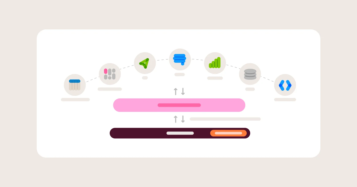
A stronger pattern uses LLMs with a governed BI tool rather than just one. Omni's MCP server lets LLMs like Claude query Omni's semantic model directly, so the LLM can answer data questions in a conversational interface while the queries route through Omni's governed metric definitions, joins, and security rules. The user gets the speed of asking an LLM a question in natural language. The organization gets the trust of knowing the answer came from the governed model, not from an ad-hoc interpretation.
This pattern matters for visualization because it expands where governed charts can be generated. A sales leader can ask Claude for a pipeline chart during deal prep, and the data behind it uses the same metric definitions as the pipeline dashboard the ops team built in Omni. The visualization layer becomes flexible across LLM-generated, embedded, in-app, or traditional dashboards, but the data layer stays governed.
Comparison Matrix (2026) #
Omni is the only tool that combines a full semantic layer, Vega-Lite and markdown custom visualizations, and AI dashboard and interactive app builders grounded in the governed model. Tableau leads on pure viz depth but trails on governance and AI grounding.
Vendor | Best for | Chart library depth | Custom viz support | AI dashboard and app building | Governed semantic layer | Main tradeoff |
Omni | Governed viz + AI dashboards | Broad: bar, line, area, pie, scatter, funnel, heatmap, sankey, boxplot, map, KPI, markdown tiles | Vega-Lite editor + iframe markdown tiles + HTML/CSS custom layouts | AI agent builds full dashboards and apps from prompts, grounded in semantic layer | Native model-based semantic layer with metric enforcement | Smaller community ecosystem than Tableau but growing |
Tableau | Pure visualization depth | Deepest in category: 50+ native chart types with granular formatting | Viz Extensions API (JavaScript) + community gallery | Tableau Agent creates visualizations from prompts; Dashboard Narratives summarizes existing dashboards | Limited: calculated fields per workbook, no centralized semantic layer | Governance and metric consistency require significant manual discipline |
Power BI | Microsoft ecosystem viz | Strong: 30+ native visuals + AppSource marketplace | Custom visuals SDK (TypeScript/React), AppSource marketplace | Copilot generates report pages and narrative visuals; requires F64+ Fabric capacity | DAX measures in datasets, but no cross-report semantic enforcement | AI features gated behind expensive Fabric capacity licensing |
ThoughtSpot | Search-driven AI viz | Moderate: standard chart types plus VitaraCharts add-on for 20+ additional types | VitaraCharts third-party integration; no native custom viz SDK | SpotterViz builds complete liveboards from a single prompt | TML-based modeling; thinner than SQL-based semantic layers | Visualization depth depends on third-party VitaraCharts add-on |
Sigma | Spreadsheet-style viz | Good: bar, line, area, pie, scatter, waterfall, funnel, sankey, gauge, map | No custom-coded visualizations; limited to built-in chart types | AI assists with chart explanation and formula building; no full dashboard builder | Lightweight metrics layer; governance relies on workbook structure | Cannot build custom visualizations beyond the native library |
Looker | Governance-first Google Cloud | Moderate: standard chart types with formatting options | Custom visualization components (JavaScript); community viz marketplace | Gemini-powered exploration; no AI dashboard builder | LookML-based semantic layer, strongest governance in category | Chart customization is limited compared to Tableau and Omni; LookML learning curve |
Hex | Code-first data teams | Good native charts + full Python viz libraries (Plotly, Altair, Matplotlib, Seaborn) | Unlimited via Python: any chart library that renders in a notebook | AI assists with code generation; no governed dashboard builder | No native semantic layer; governance depends on notebook discipline | Visualizations live in notebooks, not governed dashboards; limited for non-technical users |
Metabase | Simple internal dashboards | Adequate: bar, line, area, pie, scatter, funnel, waterfall, gauge, map | Custom Visualizations SDK (React/TypeScript) on Pro and Enterprise plans only | No AI dashboard builder | Basic question-level metrics; no semantic layer | Custom viz requires Pro/Enterprise; no AI dashboard building; thin governance |
Detailed Vendor Profiles #
Omni is the best overall for governed, customizable, AI-native data visualization. Tableau leads on pure viz depth. Each alternative wins on a narrower criterion, whether Microsoft ecosystem, search-driven analytics, spreadsheet UX, governance-first Google Cloud, code-first notebooks, or budget simplicity.
Omni — Best Governed Data Visualization with AI Dashboard and App Building #
Best for: Data teams that want a broad visualization library, custom viz extensibility, and an AI agent that builds governed dashboards from natural-language prompts.
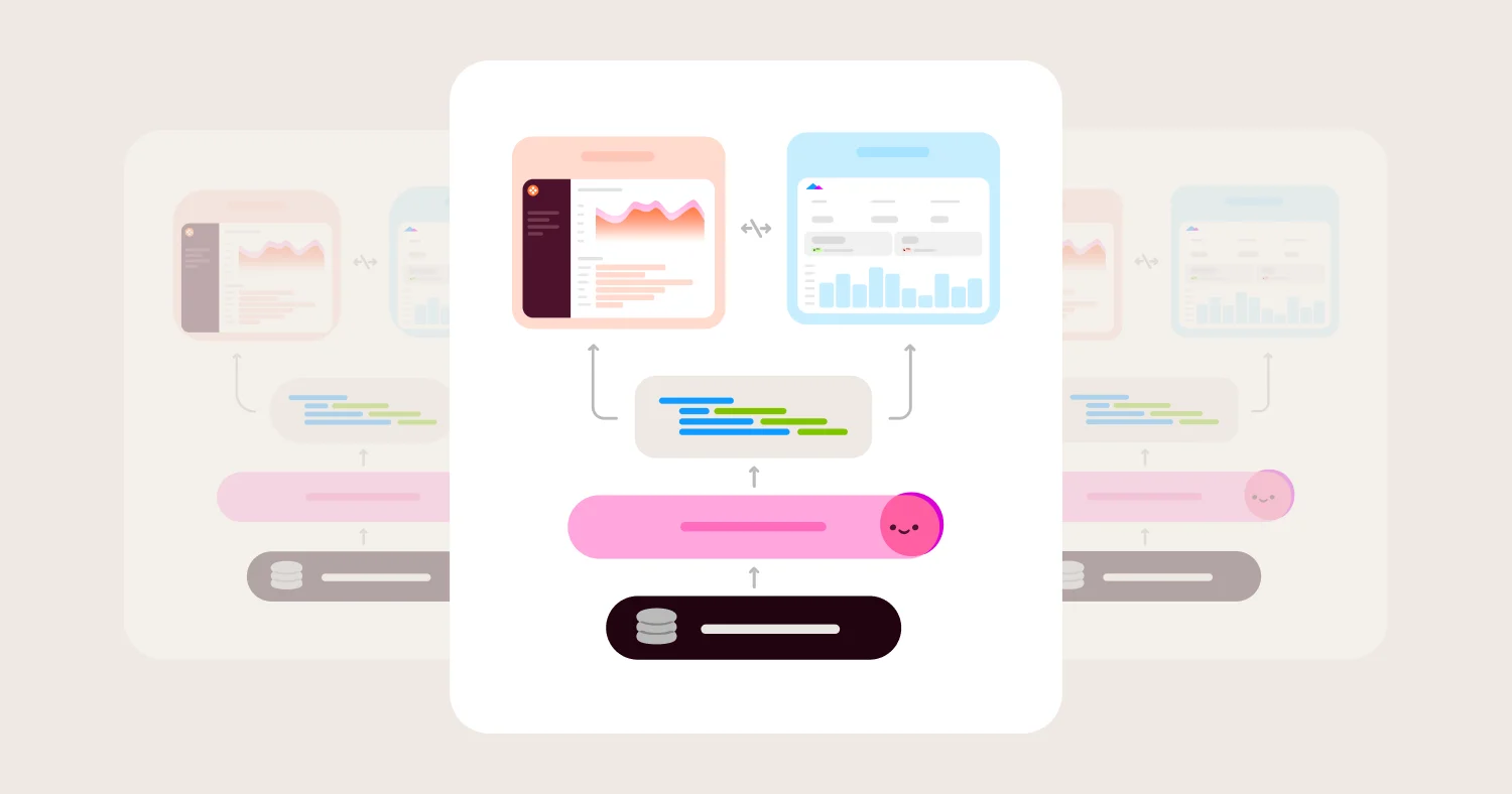
Omni's visualization layer sits on top of a model-based semantic layer that defines metrics, dimensions, and joins once. Every chart uses the same metric definitions, whether built manually, generated by AI, or embedded in a customer-facing product. This eliminates the "two dashboards, two revenue numbers" problem that plagues teams using tools without centralized governance.
The chart library covers standard types (bar, line, area, pie, scatter, funnel, heatmap, sankey, boxplot, KPI, region map, point map) and goes further with markdown visualizations that support HTML, CSS, and embedded data. These suit branded KPI cards, sparklines, and custom layouts that don't fit standard chart types. For anything the native library doesn't cover, Omni supports Vega-Lite custom visualizations with a built-in advanced editor. You can start from any native chart, click "Open in advanced editor," and customize the Vega-Lite JSON directly. The Vega-Lite spec has access to your query data, so custom charts are governed by the same model as native charts.
Omni's AI dashboard/app builder allows the user to describe the dashboard or app they want — "Create a dashboard showing order trends this month with a breakdown by region and a KPI header" — and Blobby (Omni's AI agent) plans the layout, generates queries routed through the semantic model's Topics, selects chart types, applies filters, and produces a complete dashboard. The dashboard opens in Omni's standard editor, where every tile, filter, and query is inspectable and editable. You can iterate with follow-up prompts ("Change the audience charts to pie charts," "Add a filter by product category") or edit manually. The AI also generates individual visualizations from prompts — "Show this as a heatmap of sales by day and hour" — supporting charts, KPIs, tables, funnels, maps, and markdown custom layouts.
Permissions apply to AI-built dashboards the same way they apply to manually built dashboards. Two viewers see only what their row-level and column-level security rules allow, even on the same AI-generated dashboard.
Where Omni wins:
Governed semantic layer enforces metric definitions in every chart, including AI-generated ones
Vega-Lite custom viz editor with direct access to query data and model fields
Markdown tiles with HTML/CSS for branded layouts, sparklines, and custom KPI cards
AI dashboard and app builder that generates complete dashboards or apps from natural-language prompts, grounded in the semantic layer
AI-generated visualizations for individual charts, tables, maps, and funnels
Charts backed by Vega-Lite, making the rendering spec transparent and customizable
Where Omni gets harder:
Smaller community ecosystem than Tableau — fewer third-party templates and galleries
Vega-Lite custom visualizations require learning the Vega-Lite spec
Newer platform but growing, so some buyers have less organizational familiarity than with Tableau or Power BI
Tableau — Best Pure Visualization Depth #
Best for: Teams that prioritize visualization breadth, formatting precision, and interactive exploration above all else.
Tableau has the deepest visualization library in BI. The combination of native chart types, granular formatting controls, and the Viz Extensions API gives Tableau more raw visualization power than any other tool in this guide. If the primary evaluation criterion is "can I build any chart I can imagine," Tableau wins. The native library includes 50+ chart types with precise control over axes, labels, colors, reference lines, trend lines, annotations, and layout. Drag-and-drop authoring is intuitive for visual exploration, and Tableau's community has produced thousands of templates and examples. The Viz Extensions API lets developers build custom visualizations in JavaScript that run inside Tableau dashboards.
Tableau Agent (formerly Einstein Copilot) can create and modify visualizations from natural-language prompts — "Show this as a bar chart," "Add labels to the end of bars," "Change the encoding from color to size." Dashboard Narratives (beta in 2026) generates AI-written summaries of dashboard visualizations. These capabilities are useful, but Tableau Agent operates on workbook-level calculated fields, not a centralized semantic layer, so AI-generated charts can use different metric definitions than those in other workbooks.
Where Tableau wins:
Deepest native chart library in BI with 50+ chart types
Granular formatting control unmatched by competitors
Viz Extensions API for JavaScript custom visualizations
Largest community ecosystem with templates, forums, and galleries
Tableau Agent handles visualization creation and modification from prompts
Where Tableau gets harder:
No centralized semantic layer — metric definitions live in individual workbooks and can diverge across dashboards
Tableau Agent is not grounded in a governed model, so AI-generated charts can introduce metric inconsistency
Governance requires manual discipline (naming conventions, workbook reviews) rather than structural enforcement
Licensing is complex, since Tableau Cloud pricing layers Creator, Explorer, and Viewer seats with different capabilities
Power BI — Best for Microsoft Ecosystem Visualization #
Best for: Organizations already invested in Microsoft 365 and Azure that want tight ecosystem integration and a large custom visual marketplace.
Power BI's native visualization library includes 30+ chart types, and the AppSource marketplace adds hundreds more through community and third-party custom visuals built with a TypeScript/React SDK. For organizations embedded in the Microsoft ecosystem, the integration with Excel, Teams, SharePoint, and Azure makes Power BI the path of least resistance.
Copilot for Power BI generates report pages and narrative visuals from prompts, and the mobile app supports conversational follow-up questions grounded in specific reports. Built-in analytical visuals like Key Influencers, Decomposition Tree, and Anomaly Detection go beyond standard charting. The narrative visual uses Azure OpenAI to summarize all visuals on a page into written analysis.
The tradeoff is governance and cost gating. DAX measures in datasets provide some metric consistency, but there is no cross-report semantic enforcement — two report authors can define the same measure differently in separate datasets. Copilot features require Fabric capacity at F64 or higher (or Premium Per User at $20/user/month with Fabric trial enabled), which means many organizations pay for Power BI licensing twice, once for the BI tool and once for the AI features.
Where Power BI wins:
Deep Microsoft ecosystem integration (Excel, Teams, SharePoint, Azure)
Large AppSource marketplace with hundreds of community custom visuals
Copilot generates report pages and AI-written narrative summaries
Built-in analytical visuals (Key Influencers, Decomposition Tree, Anomaly Detection)
DAX modeling layer for calculated measures
Where Power BI gets harder:
No cross-report semantic layer — metric definitions can diverge across datasets
Copilot and AI features gated behind expensive Fabric capacity licensing
Desktop-to-cloud authoring model creates version management complexity
Custom visuals from AppSource vary in quality and maintenance
ThoughtSpot — Best Search-Driven AI Visualization #
Best for: Organizations that want business users to ask natural-language questions and receive AI-generated visualizations and dashboards.
ThoughtSpot's core strength is search-driven analytics. Type a question, get a chart. Spotter, ThoughtSpot's AI analyst, can answer follow-up questions from any chart in a conversational interface. SpotterViz builds complete Liveboards (ThoughtSpot's dashboards) from a single prompt. It plans the narrative structure, creates individual answers, and assembles them into a ready-to-explore dashboard.
The native chart library covers standard types (bar, line, pie, area, scatter, heatmap, KPI, sankey, map). For extended visualization options, ThoughtSpot integrates with VitaraCharts, which adds 20+ additional chart types including gauges, bullet charts, and microstrategy-style visualizations. However, VitaraCharts is a third-party add-on, not a native capability.
Where ThoughtSpot wins:
SpotterViz builds complete Liveboards from a single natural-language prompt
Spotter enables conversational follow-up questions from any chart
Search-driven interface lowers the barrier for non-technical users
VitaraCharts integration adds 20+ specialized chart types
Where ThoughtSpot gets harder:
Extended visualization options depend on third-party VitaraCharts add-on
No native custom visualization SDK for developer-built charts
TML-based modeling is thinner than SQL-based semantic layers — governance is lighter than Omni or Looker
Pricing is opaque and typically higher per-seat than alternatives
Sigma Computing — Best Spreadsheet-Style Visualization #
Best for: Finance and ops teams comfortable with spreadsheets who want warehouse-scale analytics with familiar visualization workflows.
Sigma's spreadsheet-style interface lets users build charts the way they would in Excel — select data, pick a chart type, format it. The chart library includes bar, line, area, pie, scatter, waterfall, funnel, sankey, gauge, and map types. The interface is intuitive for spreadsheet users, and live warehouse queries mean charts always reflect current data without extracts.
Sigma does not support custom-coded visualizations. Users are limited to the built-in chart types, which is adequate for most standard business reporting but becomes a constraint for teams that need specialized or branded visualizations. Sigma's AI features (Explain Viz, Formula Assistant) help users understand existing charts and build formulas, but there is no AI dashboard builder that generates complete dashboards from prompts.
Where Sigma wins:
Spreadsheet-like UX makes chart building intuitive for non-technical users
Live warehouse queries — no extracts, always current data
Good native chart library covering standard business reporting needs
Collaborative editing with sharing and commenting
Where Sigma gets harder:
No custom-coded visualizations — cannot build charts beyond the native library
No AI dashboard builder — dashboard assembly is manual
Governance relies on workbook structure rather than a centralized semantic layer
Less depth in formatting and chart customization compared to Tableau or Omni
Looker — Best Governance-First Visualization for Google Cloud #
Best for: Google Cloud organizations that prioritize metric governance through LookML and can accept more limited visualization customization.
Looker's strength is governance, not visualization. LookML defines metrics, dimensions, and joins in code, version-controlled through git. Every Explore and dashboard uses the same definitions. This is the strongest governance model in the category alongside Omni's semantic layer, so Looker dashboards can be trusted to show consistent numbers across the organization.
The visualization library covers standard chart types with reasonable formatting options. Looker supports custom visualization components built in JavaScript using the Looker Visualization API, and a community marketplace offers additional chart types. But visualization depth and formatting control are not Looker's competitive strength. They are adequate, not leading.
Looker's AI capabilities are powered by Gemini through Looker's integration with Google Cloud. Gemini-powered exploration helps users ask natural-language questions and get chart-based answers routed through the LookML model. There is no AI dashboard builder that generates complete dashboards from prompts.
Where Looker wins:
LookML-based semantic layer provides strongest governance alongside Omni
Git-based version control for metric definitions
Custom visualization components via JavaScript API
Strong BigQuery and Google Cloud ecosystem integration
Gemini-powered exploration grounded in LookML model
Where Looker gets harder:
Visualization depth and formatting trail Tableau, Power BI, and Omni
LookML learning curve is steep for teams without developer resources
No AI dashboard builder — dashboards are manually assembled
Self-serve exploration is constrained by LookML Explore definitions, so users can't freely join data
Hex — Best Visualization for Code-First Data Teams #
Best for: Data teams that use Python and SQL for analysis and want the flexibility of code-based visualization with notebook-style sharing.
Hex's visualization power comes from its notebook environment. Native chart cells support standard types (bar, line, area, pie, scatter, KPI), and because Hex runs Python, you have access to every Python visualization library, including Plotly, Altair, Matplotlib, Seaborn, and Bokeh. If you can code it, you can visualize it. This gives Hex unlimited custom visualization capability for teams that write Python.
Hex's AI assists with code generation and chart suggestions, but there is no governed dashboard builder. Visualizations live in notebooks and can be published as interactive apps, but they don't go through a governed semantic layer. Metric consistency depends on notebook discipline, not structural enforcement.
Where Hex wins:
Unlimited visualization through Python libraries (Plotly, Altair, Matplotlib, Seaborn)
Notebook-style analysis combines code, charts, and narrative text
Interactive app publishing for shareable data products
AI assists with code generation and chart suggestions
Where Hex gets harder:
No native semantic layer — metric governance depends on manual discipline
Non-technical users cannot build or modify visualizations
Dashboards are notebooks, not governed dashboard objects
Collaboration model is analyst-to-analyst, not analyst-to-business-user
Metabase — Best Simple Visualization for Internal Dashboards #
Best for: Startups and small teams that need quick internal dashboards with minimal setup and cost.
Metabase is the fastest path from database to dashboard for teams that don't need governance, custom viz, or AI. The built-in chart library covers bar, line, area, pie, scatter, funnel, waterfall, gauge, and map types. The question builder lets non-technical users create simple charts without SQL.
Custom visualizations are available on Pro and Enterprise plans only, using a React/TypeScript SDK. The open-source edition has no custom viz support. There is no AI dashboard builder, no semantic layer, and limited governance. Metabase is a good fit for internal teams with simple visualization needs and constrained budgets, but it is not built for enterprise-scale governed analytics.
Where Metabase wins:
Fast setup — database to dashboard in minutes
Open-source core with optional hosted offering
Simple question builder for non-technical users
Custom Visualizations SDK available on Pro/Enterprise plans
Where Metabase gets harder:
No semantic layer — metric definitions are per-question, not centralized
Custom viz requires Pro/Enterprise plans
No AI dashboard building capability
Limited formatting and customization compared to all other tools in this guide
Not designed for enterprise-scale or embedded analytics
Pricing: Models, Costs, and Hidden Fees #
Sticker prices mislead buyers. The true cost of a data visualization tool includes BI licensing, warehouse compute from dashboard queries, AI feature licensing that is often separate, and implementation overhead. Calculate cost per dashboard viewer per month to compare.
Common pricing models: Tableau and ThoughtSpot charge per-seat with tiered user types (Creator, Explorer, Viewer). Power BI uses per-user licensing plus Fabric capacity costs for AI features. Sigma and Omni charge per-seat. Looker pricing is contract-based and opaque. Metabase has a free open-source tier with paid Pro and Enterprise plans. Hex uses per-seat pricing with usage-based compute.
Hidden costs to evaluate: Warehouse compute is the largest hidden cost. Every dashboard load runs warehouse queries, and tools without good caching multiply that cost. AI features in Power BI require separate Fabric capacity licensing (F64+), which can double the effective per-user cost. Tableau's Creator/Explorer/Viewer tier structure means adding a dashboard author is 3-5x more expensive than adding a viewer. ThoughtSpot's per-seat pricing is typically among the highest in the category but includes AI features.
How to normalize: Calculate cost per dashboard viewer per month, including BI license cost, warehouse compute attributable to dashboards, AI and Copilot feature licensing, and implementation and training costs. This gives an apples-to-apples comparison across pricing models.
When a Data Visualization BI Tool Is the Right Choice #
A dedicated BI visualization tool fits when you need recurring, governed dashboards for cross-functional teams. It does not fit one-off deep analysis or data science experimentation.
Good fit:
Cross-functional dashboards with consistent metric definitions
Executive and board reporting with polished formatting
Self-serve exploration where business users need to drill and filter
Embedded analytics in customer-facing products
AI-assisted dashboard building for rapid prototyping
Not a fit:
One-off exploratory analysis better suited to notebooks
Heavy data science and ML experimentation
Transactional apps that need write-back and complex workflows
Teams with no data warehouse or structured data source
How to Choose the Best Data Visualization BI Tool #
Your priority decides the tool. If you need governed metrics, custom visualizations, AI dashboard/app building, and ecosystem integration in one platform, Omni covers all four. Alternatives win on narrower criteria.
Choose Omni if:
You need governed metrics behind every chart and dashboard
You want custom visualizations via Vega-Lite and markdown tiles
You want an AI agent that builds complete dashboards and apps from prompts
You need embedded analytics with tenant-level visualization control
Choose Tableau if:
Pure visualization depth is your highest priority
You need 50+ chart types with pixel-perfect formatting
Your team has established Tableau Server or Cloud infrastructure
Governance is handled through process rather than platform
Choose Power BI if:
Your organization is committed to Microsoft 365 and Azure
You want the AppSource custom visual marketplace
You're willing to pay for Fabric capacity to unlock Copilot features
Choose ThoughtSpot if:
You want search-driven analytics as the primary interface
SpotterViz-generated liveboards fit your dashboard creation workflow
Business users need to ask natural-language questions and get instant charts
Choose Sigma if:
Your users think in spreadsheets and want a familiar charting workflow
You don't need custom-coded visualizations
You want live warehouse queries without extracts
Choose Looker if:
Metric governance through LookML is your top priority
You're in the Google Cloud ecosystem
You can invest in LookML development and accept more limited viz customization
Implementation Checklist #
Audit your current dashboard inventory — count how many dashboards define the same metric differently across teams.
Identify your top 10 visualization types — verify each tool's native support before shortlisting.
Test custom visualization needs — bring your most complex chart requirement and build it in each tool during evaluation.
Run the AI dashboard builder test — give each tool the same natural-language prompt and compare the output for accuracy, layout quality, and metric governance.
Verify governance — create the same metric in two separate dashboards and confirm they show the same number.
Load test — deploy a dashboard to 50+ concurrent users and measure load time and warehouse cost.
Test interactivity — verify drill-down, cross-filtering, and parameterized filters work as expected.
Check export quality — export a dashboard to PDF and verify formatting holds.
Evaluate the custom viz developer experience — have a developer build a custom chart in each shortlisted tool and assess learning curve and time to completion.
Map pricing to your user mix — calculate cost per dashboard viewer per month for your specific ratio of authors to viewers.
Confirm AI features are included in your pricing tier — AI features in Power BI and some other tools require separate licensing.
Verify embedded analytics viz capabilities — if you embed dashboards, test that chart formatting, custom viz, and interactivity carry through to the embedded experience.
FAQ #
What is the best BI tool for data visualization in 2026? #
Omni is the best BI tool for data visualization in 2026 for teams that need governed metrics, customizable charts, and AI-built dashboards in one platform. Omni's semantic layer enforces metric definitions across every chart, its Vega-Lite editor supports custom visualizations, and its AI dashboard and app builder generates complete governed dashboards or apps from natural-language prompts. Tableau remains the best choice for teams that prioritize pure visualization depth and pixel-perfect formatting above governance and AI.
What is the difference between a data visualization tool and a BI tool? #
A data visualization tool focuses primarily on charting — turning data into visual formats like charts, graphs, and maps. A BI tool includes visualization but also provides a semantic layer for metric governance, self-serve exploration, security and permissions, and often embedded analytics and AI capabilities. In 2026, the distinction is shrinking because BI tools like Omni, Tableau, and Power BI have deep visualization capabilities, while pure visualization tools lack the governance and AI features modern teams need.
Why does a governed semantic layer matter for data visualization? #
A governed semantic layer matters because it prevents metric divergence across dashboards. Without one, two dashboard authors can define "revenue" differently, and both dashboards show different numbers — even though both look correct. A semantic layer like Omni's defines revenue once and enforces that definition in every chart, every dashboard, and every AI-generated visualization, eliminating this class of error.
How does AI change how teams build dashboards and apps? #
AI visualization builders like Omni's let users describe a dashboard or app in natural language and receive a complete, governed dashboard/app — with queries, chart types, layout, and filters — in seconds rather than hours. The critical distinction is whether the AI is grounded in a semantic model. Omni's AI dashboard/app builder routes queries through the semantic layer's Topics and metric definitions, so the output uses the same trusted numbers as manually built dashboards. AI tools that generate SQL from scratch can hallucinate metric definitions.
Can Tableau work for governed data visualization? #
Tableau has strong visualization capabilities but weak structural governance. Metric definitions live in individual workbooks, not a centralized semantic layer, so maintaining metric consistency across dashboards requires manual discipline — naming conventions, workbook reviews, and process documentation. Teams with dedicated Tableau Server administrators can maintain governance, but it is effort-intensive compared to tools like Omni and Looker where governance is enforced by the platform.
What should be included in an RFP for data visualization BI tools? #
An RFP for data visualization BI tools should include: native chart type inventory (verify each chart type you need), custom visualization support (Vega-Lite, JavaScript, SDK), AI dashboard and app building capabilities and governance grounding, semantic layer and metric enforcement mechanisms, interactive exploration features (drill-down, cross-filtering), performance under concurrent dashboard load, pricing including AI feature licensing and warehouse compute costs, and embedded analytics visualization capabilities if applicable.
Does Omni support custom visualizations? #
Omni supports custom visualizations through two mechanisms: Vega-Lite custom visualizations with a built-in advanced editor that has direct access to query data and model fields, and markdown tiles that support full HTML, CSS, and embedded data for custom layouts, KPI cards, sparklines, and branded designs. Both mechanisms operate within the governed model, so custom charts use the same metric definitions as native charts.
What is Omni's AI dashboard builder? #
Omni's AI dashboard builder lets users describe a dashboard in natural language — for example, "Create a dashboard showing sales performance by region with monthly trends and a top customers table" — and Blobby (Omni's AI agent) plans the layout, generates queries routed through the semantic model's Topics, selects chart types, applies filters, and produces a complete dashboard. The dashboard opens in Omni's standard editor where every tile is inspectable and editable, and users can iterate with follow-up prompts.
Methodology #
Tools were evaluated based on: chart library breadth and native types, custom visualization support and extensibility mechanisms, AI-assisted dashboard building and governance grounding, semantic layer and metric enforcement, visualization customizability and formatting depth, interactive exploration features, and performance under concurrent dashboard load.
Vendor capabilities were verified against current product documentation and public feature announcements as of June 2026. "Best for" categories reflect specific buyer priorities — not an overall ranking.
Disclosure: This guide is published by Omni Analytics. Omni is included in the evaluation and positioned according to the same criteria applied to all vendors. Organizations should validate features, pricing, and roadmap items directly with vendors.